Services Plugins FAQs

Plyr - Responsive Height Not Changing

Hi there - just a quick one. I purchased the new Plyr video player plugin and have started trying to implement it. Liking it so far, but the height of the element doesn’t seem to be responsive as width changes to keep the aspect ratio the same. I also purchased your Tubely template, which uses the Video.js plugin, but that plugin won’t stream Vimeo & Youtube. I needed a player that would stream all three, so I bought this one hoping it would be an option.

Any help would be greatly appreciated.

Best, Brian

Hi @brian.schuring,

Thanks for using our products. This plugin is automatically calculating the aspect ratio to be responsive, however, in case you want the element to resize based on video size, unfortunately this plugin cannot accomplish this functionality. It is not something we can influence as it is an external source. But it might be a future improvement of this plugin in the next updated version.

Regarding Tubely, it uses the Video.js external plugin which we I’m afraid we cannot help on this matter, however it is absolutely possible to make template changes you’d like to meet the desirable functionality of your app. You could even integrate the Plyr plugin if you will.

Note: if you have any issues with a different product, could you please post a separate forum request, so perhaps one of other team members could provide help faster.

Thank you for understanding :pray:

Best,
Alex

Thanks Alex,

I think there may have been some confusion on this. I’m not asking for the player to change size based on the video size. I’m asking for the player’s height to change in response to the players width based on the aspect ratio that’s been set when the player is installed. Very similar to what happens on your All of that happens on the page and none of it is an external source.

I was pointing out the Tubely example to show how the Video.js player (and most other video players) height responds to the width of the page (not the underlying level of the video). Youtube does the same.

Asking the question another way, when you say the player itself is responsive, what actions specifically make it responsive? Is it only width responsive or width and height responsive?

Looking forward to hearing more.

Best,
Brian

Hi @brian.schuring, thank you for your feedback. After another round of testing there is an issue with responsive height, indeed. Apologies for inconveniences. Let us fix this problem and I’ll get back to with a notification on plugin fix as soon as possible. Thank you in advance for patience.

Thanks for the quick response Alex. Thanks to Team Zeroqode and this template, we’ve nearly turned around a major new feature for our platform in under a week. This responsive height issue is one of the last things holding us back from launching, so we’re excited to see the updated implementation!

Best,
Brian

Hey Alex - following up here quickly as this is now one of the few items left holding us back from a proper launch of our on-demand library functionality. If there’s something we can do from our side as a workaround I’m happy to do it rather than asking you guys. Just trying to get something out that looks right across all screen sizes.

Hi @brian.schuring, I can understand your situation. I have not forgot about your issue, our team is working on plugin fix. I’m afraid I cannot guarantee any estimates, but I will notify you on plugin update as soon as possible. However, there is a possible workaround that might work in case it is really urgent. You can add the plugin element into a Group element, then manipulate the group itself to whether set the height and width to be fixed or responsive. Hope this is helpful and thank you again for understanding :pray:

Thanks Alex. I’ve built a workaound here only to find out your full-screen button doesn’t work on mobile (iPhone, Safari & Chrome). Bit confused how or why you’d publish and sell a plugin that clearly doesn’t work on mobile.

Hi @brian.schuring, thank you for feedback. I’m afraid the full-screen size issue is not reproducing on our side. Please check on plugins configurations again just to make sure it has been set up properly, here - https://docs.zeroqode.com/plugins/zeroqode-video-player-plyr-plugin. It it still doesn’t work, could you please share screenshots or a video of the problem to showcase, also of your app and workflow? This is a recently uploaded plugin so it is brand new. Apologies for inconveniences created, but it could happen that something might not work as expected for our customers. However, we are here to provide you with help and fix the problems regarding our products asap. I hope you can understand :pray:

Thanks Alex. As you might imagine, we’re well aware that new software launches with small bugs and glitches. It happens all the time and as shown in our interactions with Zeroqode on this forum, we have a history of being patient with those bugs with Zeroqode. As a business we’ve spent well over $1,000 with Zeroqode on various templates and plugins and have tried each time to help improve each product for everyone where we see the opportunity.

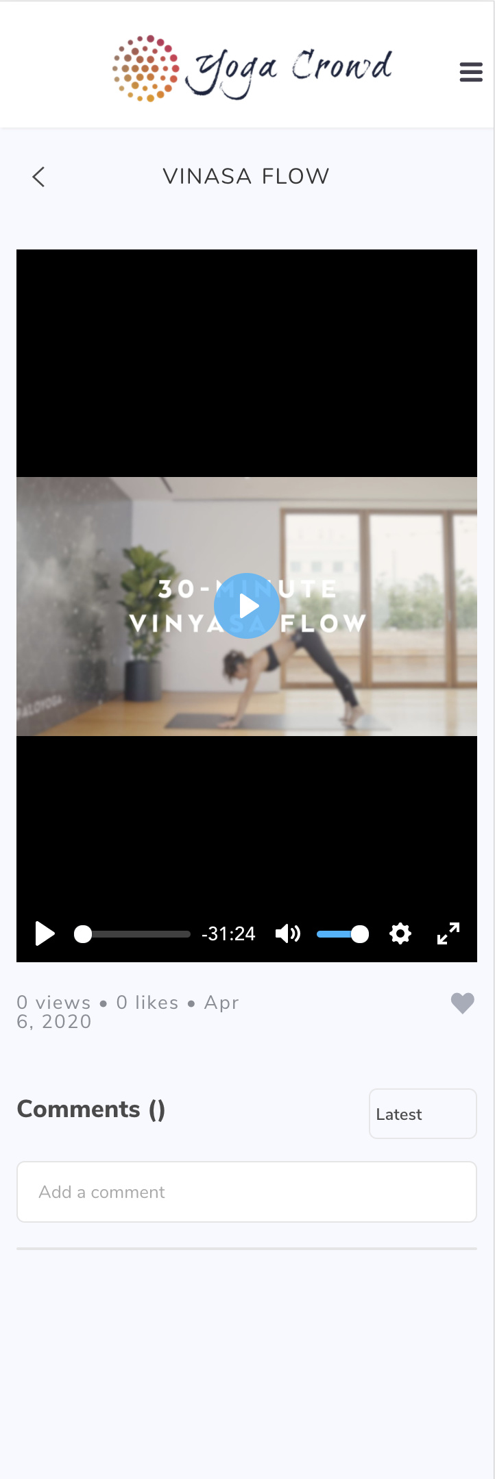
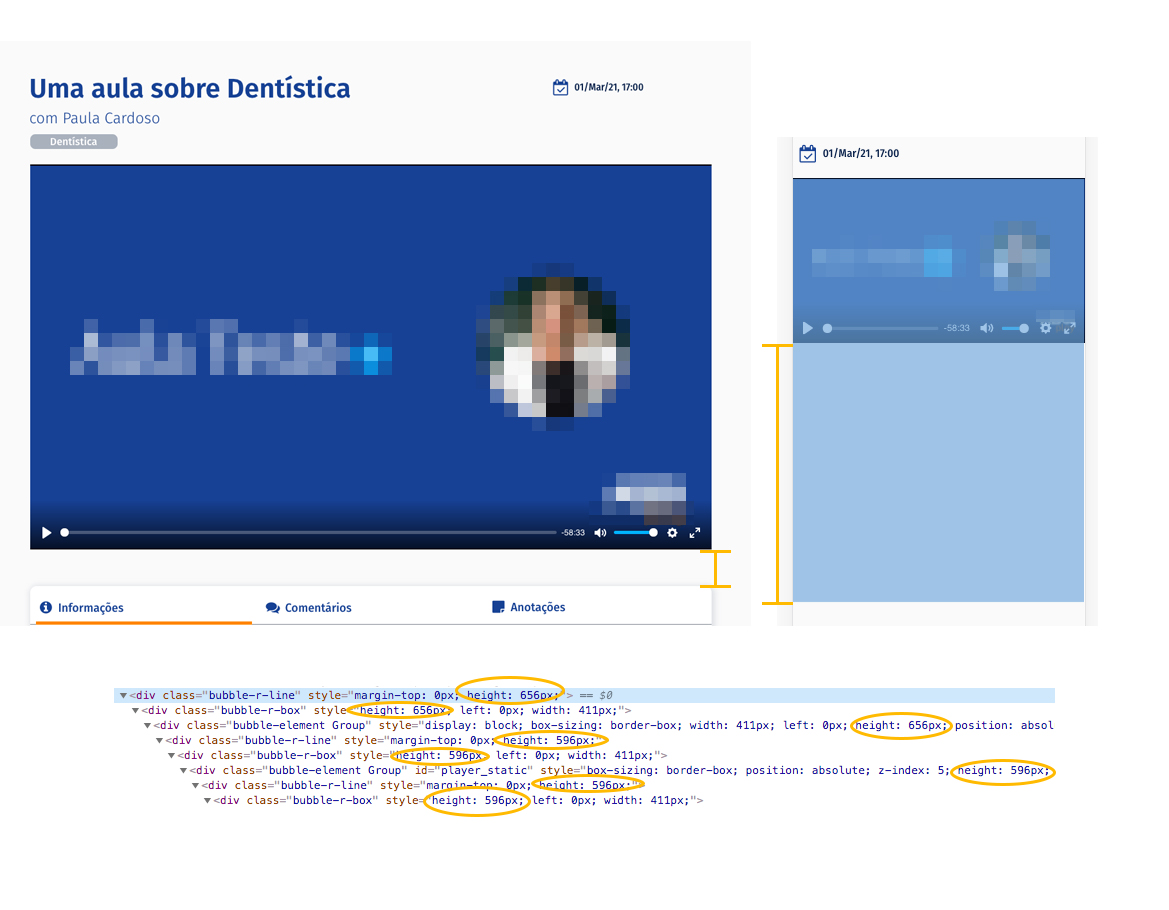
In this case though, launching a video player that isn’t compatible across multiple screen sizes either in the original display or in the full-screen mode doesn’t seem all that client-friendly - especially when it’s now taken over a week to address the post that started this conversation.

The strategy you guys are following - launch a ton of products quickly that you know will have bugs and sell them to live clients, then bug fix them all as they’re flagged - only works when you fix things quickly. Otherwise you end up blocking feature launches for people who are diligent enough to actually test them across multiple screen sizes prior to launching or, worse yet, making your own clients look bad when they launch your products to their clients, only to later find out they (i) don’t work correctly and (ii) aren’t fixed quickly.

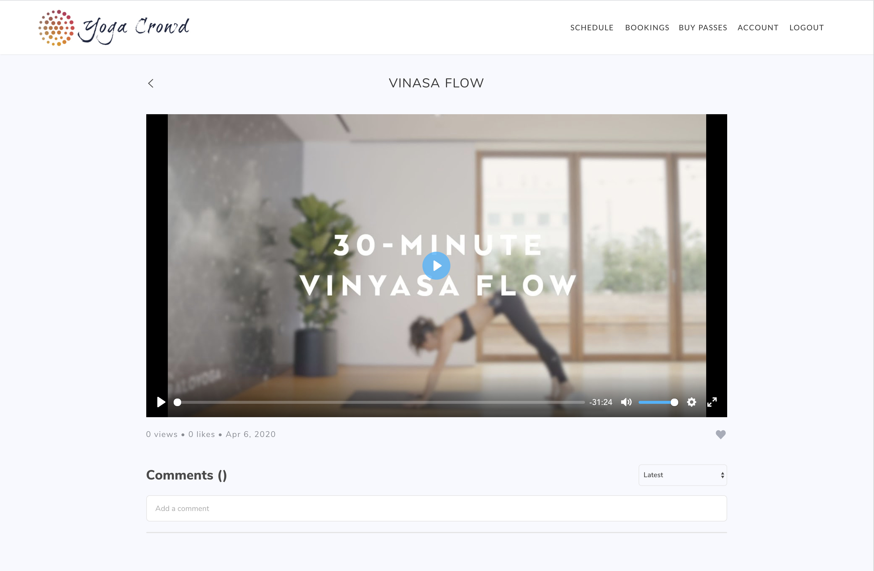
Here’s the video you asked for.

https://vimeo.com/408075167

Hi @brian.schuring, thank you for feedback. I’m reaching out to notify you on plugin fix regarding responsive height. Please do upgrade the plugin to the latest version, refresh your app and give it a try.

Regarding the full-screen, without knowing more about your element and workflow settings, this specific issue seems to be related to Bubble styles. We cannot influence on this matter, but if we will, the plugin might not work.

The current state of the plugin works within platform possibilities with the best possible outcome, without interference on the Bubble styles.

Thank you for understanding.
:pray:

I’m facing a problem regarding the responsiveness of the element.
The video aspect ratio always resize properly, but the element(s) that contains the player doesn’t follow the height, which creates a huge gap on mobile versions.

I really can’t tell if is a plugin’s issue or Bubble’s architecture issue.
There are so many elements with fixed height and that makes impossible to target them via CSS (as it looks like I can’t add an ID to them all).

Any thoughts on this?

Hi @falecom, thanks for reaching out.

Allow us to analyze the issue and check on our side for any possible solution.
We will come back in due course.

Regards,

The page is this one: https://aboplay.bubbleapps.io/version-test/aula/este-e-mais-um-curso-de-exemplo
I even have two versions of it, with two different dimensions for the video element (seen here: https://aboplay.bubbleapps.io/version-test/aula/aula-01).

I tried a workaround with a HTML element on the page, with a CSS and media queries to pull up the next element (it kinda works) but I’m considering creating a different layout for the mobile.

But it would be great if the element height could shrink along with the video player itself (because it looks like that this is the issue – meaning that the container retains the height of the element built in the editor and doesn’t respond to the player that’s rendered on the frontend).

Hi @falecom, thanks for your patience and thoughts on this.

Unfortunately, this issue is caused by the Bubble platform limitation itself and is not related to the Plyr element display settings.

Allow me to propose the following workaround that works in this case (which repeats your idea also):

  • create two containers with similar content, one for usual web view, and the second one for mobile app view
  • set up a condition, when page view shrinks to xxxx value - it switches to the mobile app view.

Hope it helps.

Regards,