Services Plugins FAQs

Air Bar Chart issues

Hey there,

I’m trying to do something very basic with the bar chart, but it simply doesn’t work.

In my database, I store cases with various attributes, including location (countries) and rating (positive, neutral, low, medium, high).

Using the bar chart plugin, I’m trying to display the number of cases, grouped by location, with multiple series corresponding to case’s rating.

Here is what I’ve done:

  • Series category : search for cases, grouped by countries, each Country name (list of texts)
  • Series 1 name : High - Series 1 data : search for cases (with constraint on rating = high), grouped by countries, each items count

etc for every other series.

In my database, I currently have two cases, one in country France, rating High ; and one in country US, rating Low. On the chart, only France is showing on the X axis.

Any idea ?
Thanks in advance

Hello @spacetouristmusic,

Thank you for reaching out.

Could you please specify which exact plugin you are using? We have multiple plugins with charts.

Could you please provide additional details about your use case?

Namely, screenshots and screencasts of your workflow setup, plugin element settings, how you set the data table and your App data, the issue you see, and the expected result, for screencast recording I can suggest using the Loom tool.

These details will help us reproduce your setup on our side and look into it.

Thank you once again and looking forward to your reply.

Best regards,
Stephan

Hi @Stephan

Sorry, forgot to be specific :slight_smile:
I’m using the Air Bar Chart Lite plugin.

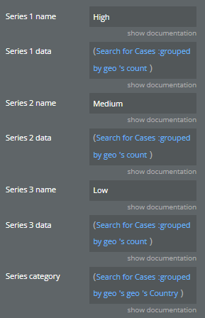
  1. Here are the plugin settings:
    image

  2. I’m adding two extra series with a button, series which correspond to “Positive” rating and “Neutral” rating.

  3. In my data table, I have two entries (2 cases). One of them has the following fields: Geo: France, Rating = High ; the second has Geo : United Kingdom, Rating = Positive.

Here is what I’m getting :

As you can see, United Kingdom is not displaying in the X axis, and France has 2 series associated.

Hello @spacetouristmusic ,

Thank you for providing further details.

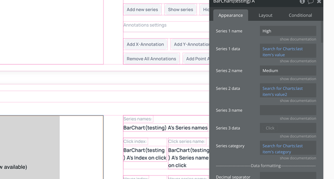
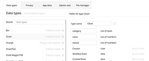
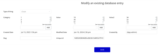
Your setup appears to be mostly appropriate, however, its effectiveness largely hinges on how you organize your data. For a practical illustration, I recommend visiting our demo page and following the example provided as an initial step.

It’s crucial to ensure that your data is configured correctly, as shown here:

Following that, verify that the correct values are being retrieved in the element:

I hope you find this information beneficial. Should you have any questions or require further assistance, please don’t hesitate to reach out.

Looking forward to your response.

Best regards,
Stephan

Hi again Stephan,

Thanks for your help

From what I understood, I should have the data used by the chart structured like this, correct?

Problem is: setting a new data type (for instance, “Chart data”) would be very difficult as I have a list of 300+ countries… it means calculating and updating every list, every time a single case’s rating is changed.

I would prefer using my current data structure (data type “Case”, fields “geo” and fields “rating”) but I can not find a way to build the expected structure out of it.

  • The search for cases, grouped by geos, each geo’s country name actually gives me the right list:
    “France, United Kingdom, Germany”
  • What I can not find a way to do is to create the list of values for each rating, for each country. If I put a constraint on the search for cases (risk = high), I won’t have the 0 included.

Any idea ? Maybe it’s simply not doable :slight_smile:

Hello @spacetouristmusic ,

Thank you for your message. We apologize for the delayed response over the weekend.

Based on the Excel screenshot you provided, it seems like you are separating the list items with a comma. However, in our case, the items are a list type of text/numbers and they only appear with commas after being added, its the way Bubble shows them.


It’s important to acknowledge that the plugin might have limitations in processing data the way you envision. However, you are encouraged to explore different ways to format your data for compatibility with the plugin.

It would be helpful if you could provide an image example of the chart you want to create, so I can better determine if it’s achievable to create with the plugin and provide general guidance on it.

Thank you once again for your patience and understanding.

Looking forward to your reply.

Best regards,
Stephan