Services Plugins FAQs

Air Chart Pro - expressions

Hi there, my name is Fernando. Hope you’re all well.
I just got the Air Chart Pro to use on my dashboard and it looks great.
However, there are a few things i’m having a hard time to do there

First is to use an expression as a ‘Series Data’. I have in the database the incomes and the payments, but not the final result for it is calculated.
How can i have it in the charts?

Second, how to remove the gap in the line chart? So it doesn’t have isolated dots

Last, i couldn’t find where to change the legend color, just the position, alignment and size

Thank you in advance.

Screen Shot 2023-11-23 at 09.50.41
Screen Shot 2023-11-23 at 09.50.54

Hello @fernandogdf ,
Thank you for your purchase and sorry for long reply due to the weekend.

I am sorry to hear that you have had difficulties with our plugin. We have passed this information to the development team, they will check it and we will get back to you as soon as possible.

Additionally, can you please also tell me the version of the plugin you are currently using and the Bubble version?This information will help me better understand your problem

Thank you once more, and I`m looking forward to hearing from you soon.

Wish you a great day!

1 Like

Hey @AntonZ ,
Thank you for your reply!

The plugin is great! It’s just a few things i couldn’t find.

I’m currently using the Air Chart pro: 182 Premium Charts v 1.14.0
And Bubble v.21

Regards

Hello @fernandogdf ,
Thank you for the additional information.

I have sent this information to the developer team.
As soon as I receive a reply from them, I will contact you.

Thank you for your understanding
Cheers!

Hello @fernandogdf ,
Thank you for your patience.

Below I have outlined the answers to all three of the questions you asked:

1)Expression as “series data”: You mentioned the difficulty in using expression for series data, especially for computed results such as net income. To help you better, could you provide us with more information? A video or screenshot demonstrating the issue, a clearer explanation of the problem, and any additional details about your use case would be incredibly helpful.

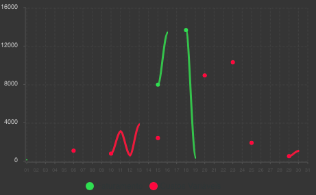
2)Fixing gaps in a line chart: It looks like the dashed lines in your chart are caused by empty values in the database. To fix this problem, you have two options:
-Fill the empty cells in the database, or
-Use a function in the chart settings to replace blank values with null values. This will provide a continuous line chart with no isolated points, but then the chart will go to 0 and return to the correct position when it finds a filled position in the database.

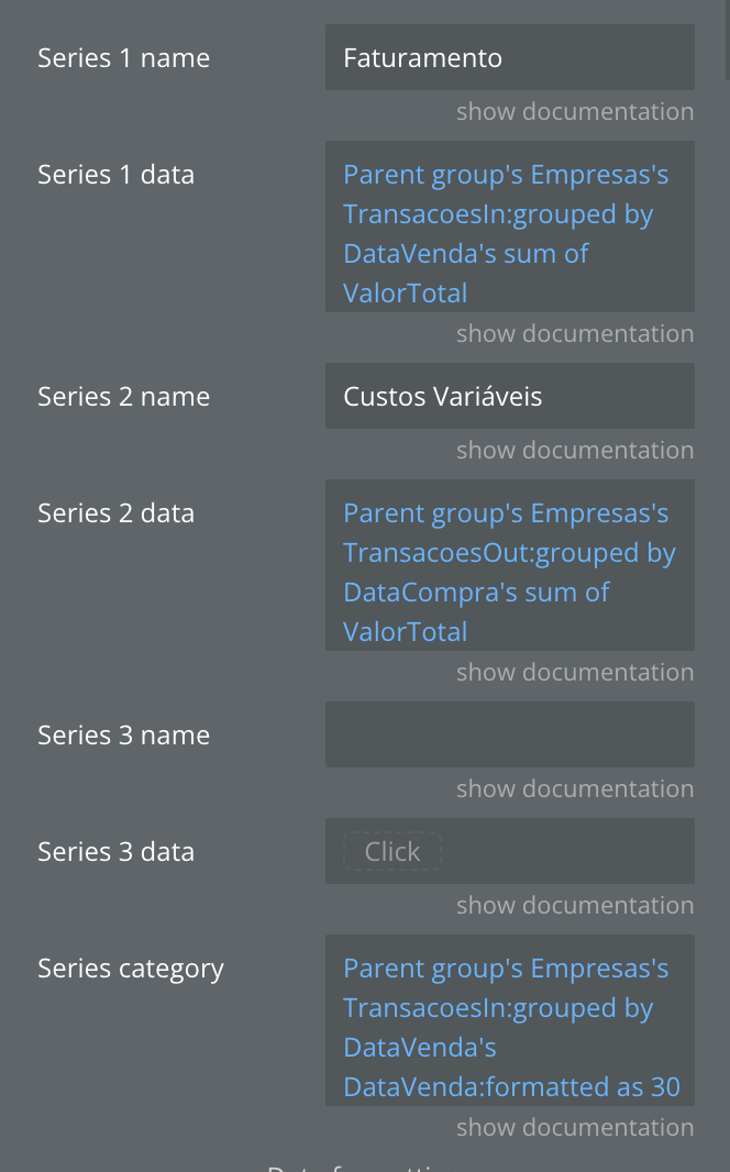
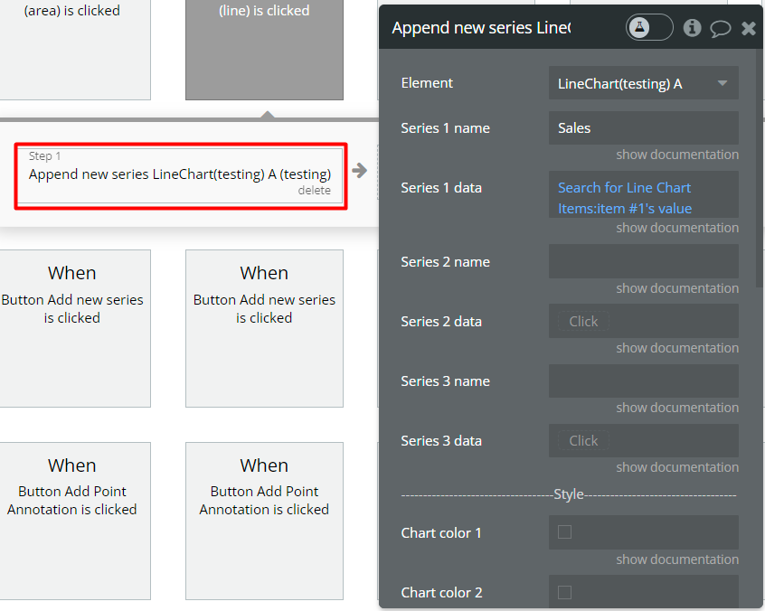
3)Changing the legend color: To change the color of the circles in the legend, you must select the colors for the lines on the chart. The legend colors depend on the colors selected for the lines in the Style section of the chart settings.

I’m attaching screenshots to guide you through steps 2(Gaps) and 3(Color). Please take a look at them for a clearer understanding.

Your feedback and additional information will enable us to provide more targeted assistance.

Cheers!

Hi @AntonZ ,
Thank you for your time

  1. I actually would need 4 Series in the Line Chart to get the results i’m looking for, but i can work for now with only 3.
    Series 1 = value of the sales of the month (income)
    Series 2 = Variable costs
    Series 3 = Fixed costs
    Series 4 = Income - Variable - fixed
    If there’s no way to have 4 series, i’ll put 2 and 3 in the same series
    There is an example below of a chart i’ve done in google sheets


  2. FIXED!! Thank you

  3. I’ve done it already, but it changes only the circle, not the text

Thanks again for your help

Cheers!

Hello @fernandogdf ,
Thank you for sharing additional information.

I will check this with development team and come back to you as soon as possible.

Thank you for

Hey @AntonZ ,
Hope you are doing well

I figured it out how to change the color of the legend using html, so problem 3 fixed.

Still can’t do expressions though

Looking forward for the feedback from the development team

Hello @fernandogdf ,
Thank you for your patience and sorry for long reply.

  1. From the details provided, I understand that you need to insert a 4th series into the chart. It can use the Append new series action to insert another series.
  1. Regarding color
    Our developers are currently working on your proposal and will soon update this plugin so that you can change the color within the plugin settings, not through HTML

Thank you for understanding and cooperation.

Cheers!

Hi @AntonZ ,

I believe my question wasn’t clear, sorry for that.
What i’m trying to do is to put an expression as a Serie
For example:

  • Series 1 would be A
  • Series 2 would be B
  • Series 3 would be A-B (the result of A minus the result of B)

The possibility to add a 4th series is a great bonus, thank you for that!
But what i really need in the chart is to have the “A” bars, the “B” bars and the results or “A-B” bars

Thanks again

Fernando

Hello @fernandogdf ,
Thank you for sharing additional information.

I’d like to inform you that the plugin elements themselves do not support conducting mathematical operations between series directly within the elements. Therefore, it would be necessary for you to calculate the difference between series A and B separately, utilizing Bubble’s native tools.

Once you have calculated these differences, you can store the results in a convenient location, such as a custom state or a database. Then, the obtained list should be used in the chart elements.

If you need any further assistance or have more questions, please feel free to reach out.
Сheers!

Hello @fernandogdf ,
Thank you for your patience.

I am happy to announce that we have effectively resolved the issue(color settings) with the Air Chart Pro plugin action and updated it to version 1.16.0.

Could you please update the plugin in your application to this latest version and confirm that you can now update the colors in the plugin settings.

Feel free to explore the plugin’s functionality on our demo page.

Your patience and cooperation throughout this process have been greatly appreciated.

Cheers!

1 Like

Hello @fernandogdf ,

I would like to inform you that our team is currently working on updating the plugin so that this feature you are talking about: 1)Expression as “series data”.

Soon we will add an element for doing the mathematical operations between 2 lists.

We will be sure to let you know when this happens, thank you for your understanding and patience :blush:

Сheers!

2 Likes

Hello @fernandogdf,

Thank you for your patience.

I am happy to announce that we have updated the Air Chart Pro plugin to version 1.17.0.

In the new update, our developers: Fixed optional fields with null values and added the “List Calculation” element.

Could you kindly update the plugin within your app to this latest version and confirm whether everything is now operating smoothly?

If you have any more questions related to our products, feel free to ask.

Wishing you a happy holiday season ahead. :christmas_tree:

Best regards,