Services Plugins FAQs

AirBnB Course video 1. Changes/needs update

In the first video you just click “Add a stripe” this functionality doesn’t exist anymore. Could you please advise as to the best way to recreate this?

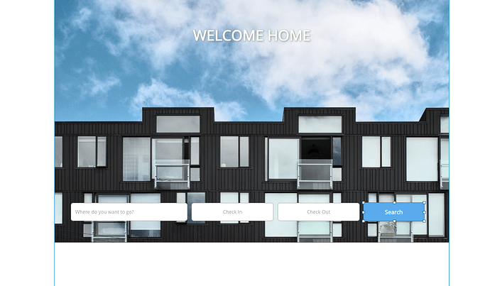
If I add an image (H 660 as in the video) it doesn’t seem to scale appropriately on the preview. Alternatively if I add a group first and then the image (again H 660) it looks different again.

Could you please let me know which is the correct way to do this? IE: Group then image, or just image on its own. The exact W and H would be really helpful as well.

Preview:


Editor:

Also inputs/buttons in the editor do not appear in the same way. Is there an update on the settings for the buttons as well?

Hi Brendan!

Looks like youre containers have maximum width. For background image it’s ok, but you need to edit width of container where are inputs located.

Hi! Thanks for the reply!

Just to clarify in the video the inputs are contained within a “stripe” which doesn’t seem to exist anymore. As a result there is no container just the image and then inputs on top.

When you say container do you mean I should put a “group” on top of the image and contain the inputs within that? If I do that how can I limit the maximum width?

Sorry for all the questions… I really think the video should be updated to reflect these changes.

Yes, you got me right. Put all the inputs in the container and enable “apply a max width when the page is stretched” option.

Facing the same issue. Will be great if someone can provide the answer for this stripe thing

please check out this video that covers how to make responsive pages (including stripes)

1 Like