
Referring to this plugin: Gantt Charts Plugin for Bubble | Plugin for Bubble by Zeroqode
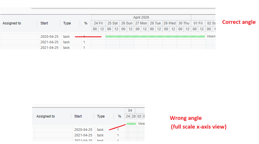
It seems that when i scale the x-axis at max, the angle between the rows to the left doesn’t match the visual lines to the right? It seems that when the x-axis is at this scale, the “Month” tab at the top dissapears, and the group jumps up and makes the angle wrong. Will this be fixed? 
It’s a excellent plugin otherwise!
Another tip: scale the calender view a little bit forward from the last date and row, so the label text will be visible (now it cuts it off).
Br, Endre
