Hey @hassan 
Thanks for reaching out! 
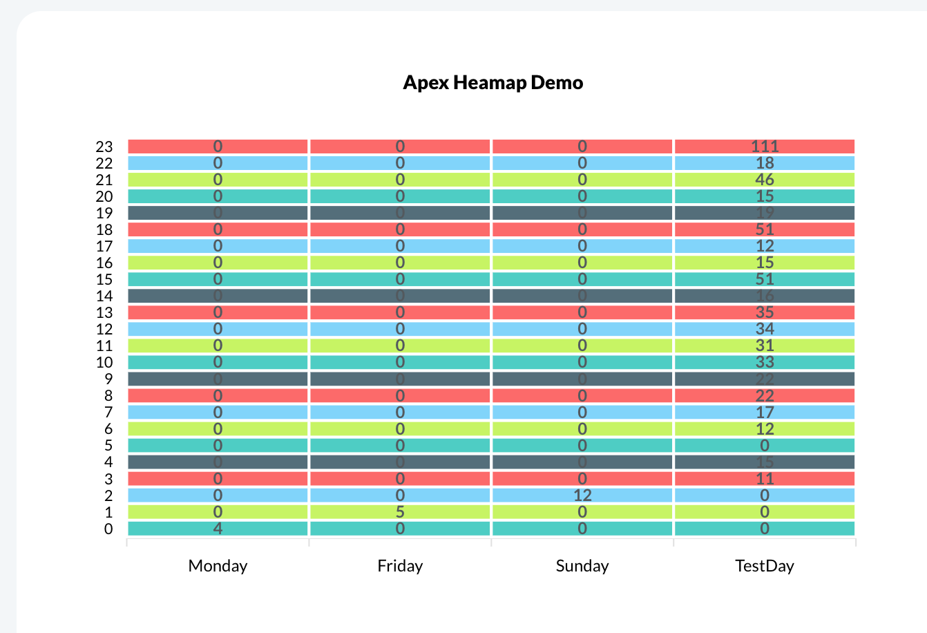
Great question — a 24 x 7 heatmap of order activity is definitely a powerful way to visualize peak demand times. You’re on the right track thinking of using the Apex Charts plugin, and while the plugin does support heatmaps, there are a few important things to keep in mind to make this setup work correctly.
Yes, the plugin does support heatmaps, but it expects your data to be structured in a way that clearly defines both axes — in this case, the hour of the day (0–23) and the day of the week (Sun–Sat).
Why you need specific data fields
Right now, since your database only has the Date Created field, you’ll need to extract the hour and day from that field to build a meaningful heatmap. Unfortunately, this can’t be done on-the-fly inside the chart — the heatmap data must be pre-processed into a format the chart can consume.
You can create two extra fields in your database (or generate them dynamically via searches/workflows):
-
 Day of Week → Extracted from
 Date Created (e.g., “Monday”, “Tuesday”, etc.)
-
 Hour of Day → Extracted from
 Date Created (0 to 23)
This way, each order can be grouped into a specific time block. Then you can aggregate and feed this structured dataset into the chart.
Alternative (dynamic) approach
If you prefer not to store extra fields in your DB, you could:
- Use Bubble’s :formatted as functions to extract the day/hour when retrieving data
- Aggregate the data in a custom backend workflow or repeating group and then pass it to the chart in the required format (array of series objects)
You can review the plugin docs and supported chart types here:
 Apex Chart Plugin Docs
Looking forward to your reply. 
Best,
Support Team
Browse all Zeroqode Plugins for bubble


 It’s always a pleasure to help, and we truly appreciate having you as part of our community.