Services Plugins FAQs

ApexGraphs duplicating colors when appending data

Hello!

I’m using ApexGraphs to create a couple complicated graphs with a lot of data points for a client in Bubble.

The multiple data points require me to append data to the graphs. I’m having similar issue on a multi-series graph and a mixed chart [area + bar].

Even though I have unique colors set for each appended data point in my workflow, it either appends all the same color (multi-series line graph), or makes colors in pairs (mixed chart).

How can I get these colors distinct on the graphs? Is this a bug?

See attached screenshot of the graphs for reference.

Thanks for any help that can be provided!

Trying to bump this issue…

Hi @cmagee ,

Thank you for reaching out and apologies for the delayed response over the weekend :blush:

It looks like ApexChart may be reusing or overriding colors when appending data. Let’s go through some steps to fix this:

:one: Ensure Unique Colors Are Assigned Properly

  • When appending data, make sure that each series has a distinct color set dynamically.
  • If you’re using a list of colors, check that it correctly corresponds to each data series.

:two: Manually Assign Colors for Each Series

  • ApexCharts uses a predefined color scheme unless manually overridden. Try assigning colors per series before appending them, rather than setting a bulk color list.
  • In the Append Data to Chart action, ensure the “Color” field is set dynamically for each new data point.

:three: Append Data Individually Instead of in Bulk

  • If colors are appearing in pairs (especially in mixed charts), try appending one series at a time instead of passing all data points at once.

:four: Check the Order of Data & Colors

  • Ensure that the data and color values are aligned properly when appending to the graph. A mismatch in the order could cause repeated colors.

Could you share a screenshot of your workflow setup for appending data? That would help pinpoint if anything needs adjusting!

Looking forward to your reply. :rocket:

Regards,
Support Team
Browse all Zeroqode Plugins for Bubble
Banner_Last3

Hi @mina.rotari ,

Thank you for your response.

1 + 2. Yes, each series has a distinct color set.
3. I am appending data series one at a time in the workflow.
4. Yes, everything is in order.

Here is a screenshot of the workflows. First one is the multi-line line graph, the second is the stacked bar graph.

Hi @cmagee,

Thanks for sharing the screenshots! It looks like you’re on the right track with appending data for your graphs, but the color issue likely comes down to how colors are assigned across the series.

Here are a few things to check:

  1. Unique Color Assignment
    It seems like the color for each series is being set to the same value (#FFC101 or #F15F22). To ensure distinct colors, double-check that each series gets a unique color. If you’re setting the color statically (e.g., for all series), the charts will reuse the same color. Consider assigning a different color for each series dynamically or manually setting different colors for each data point.
  2. Ensure Data is Fully Loaded
    When appending data in multiple steps, ensure the data is fully loaded before appending the next series. Sometimes the chart doesn’t refresh properly if the data isn’t fully updated before the next append action. You can add a short delay between each append to ensure the chart refreshes after each data update.
  3. Check the Chart Types
    With mixed chart types (e.g., line and bar), color assignments can sometimes get confused. Make sure each series is clearly defined with a unique color for both types.

Let me know if this helps, or feel free to share more details if the issue persists!

Best regards,
Support Team
Browse all Zeroqode Plugins for Bubble
Banner_Last3

Thanks @mina.rotari!

I appreciate your effort in helping me resolve this.

  1. The color for each series is unique.
  2. I added a 500 millisecond pause between each workflow step, but still got the same results.
  3. The chart types are all set correctly.

It still seems like a bug to me, but I’m more than happy to try some more ideas to help resolve these two graphs!

Hi @cmagee,

Thanks for testing those steps and sharing more details.

Based on what you’ve described, it doesn’t seem like a bug, but rather something related to how the colors are being assigned when appending data. To help pinpoint the issue, would you be able to do a quick test?

  1. Add a new ApexChart element to a blank page.
  2. Manually add two or three data series (without appending) and assign distinct colors to each.
  3. Check if the colors display correctly when the chart loads.

If the colors show up correctly, then the issue is likely related to how the append function is handling colors. In that case, we can take a closer look at how the colors are being assigned dynamically in your workflow.

Let me know what you find, and we’ll go from there!

Regards,

Support Team
Browse all Zeroqode Plugins for Bubble
Banner_Last3

Hi @mina.rotari,

Thanks again for the help.

I created the a new element without the workflow, and all the colors showed up as they should. The problem seems to be the appended data series. The data is correct, but the colors are wrong. Each appended data series has different colors in the workflow steps - but they are either skipping to every other color (mixed area/bar graph), or are repeating the first appended color (multiple line graph).

Bubble did change their workflows not too long ago. I wonder if there is an issue with appending in the new workflows. The bubble demo I have been using for reference has the old workflows.

Hi @cmagee,

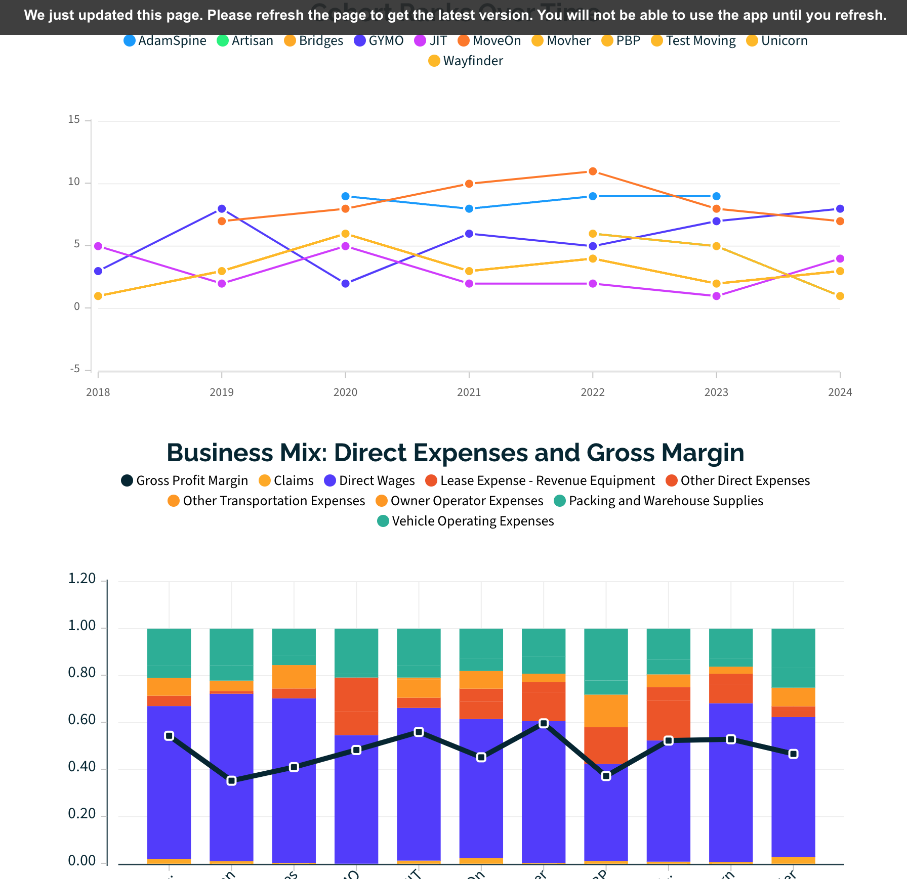
Thanks for running that test! Since the colors display correctly when the chart loads initially but not when appending data, it does seem like the issue lies in how the append function is handling color assignments.

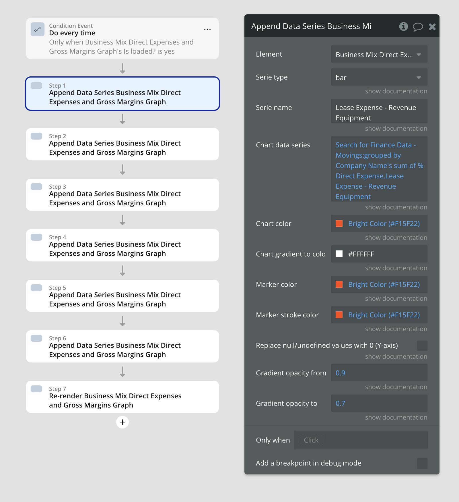
Given that Bubble recently changed its workflow engine, it’s possible that something in the way data is appended has been affected. However, let’s try a few more things to rule out any potential causes on our end:

Next Steps to Test:

:one: Test Assigning Colors via a Custom State First

  • Instead of setting the color dynamically within the workflow step, store an array of unique colors in a custom state and reference them when appending data.
  • This can help ensure that colors are assigned in the right sequence and prevent any unexpected overwrites.

:two: Append One Series, Then Refresh Chart

  • Try appending only one series, then refreshing the chart before appending the next.
  • If the colors are correct with one series but change when adding another, it might indicate a Bubble-side issue with how the append function queues updates.

:three: Use Console Logs to Verify Assigned Colors

  • If possible, log the color values assigned to each appended series in the Bubble debugger or console log to check if the colors are actually changing before they’re appended.
  • If Bubble is processing them in a different order than expected, that could explain why some colors are skipped.

:four: Test on an Older Version of Bubble

  • If you have access to an older version of your app or a different environment, try running the same workflow there to see if the issue persists.
  • If the colors append correctly in an older version, this would suggest a change in Bubble’s workflow processing.

Since we provide general support related to plugin issues and bug fixes, we can assist with anything directly related to the plugin’s functionality. However, if the issue stems from Bubble’s workflow engine changes, it may be outside of our control.

Let us know what you find after testing these steps, and we’ll be happy to assist further where we can! :blush:

Best,
Support Team
Browse all Zeroqode Plugins for Bubble
Banner_Last3