Services Plugins FAQs

AWS File Uploader Plugin - Styling

Hi,

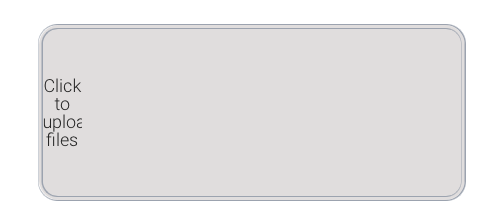
I really like the File Uploader Plugin but the default styling looks pretty bad for me (see attached image).
The “Click to upload files” is wedged into the corner of the element and barely clickable.

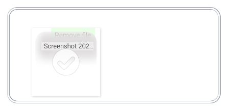
Additionally, the remove file text is not clickable after upload because its behind the thumbnail.

How can I change this?

Screenshot 2021-08-13 at 10.14.52
Screenshot 2021-08-13 at 10.41.20

Hello, @majako91
Thanks for reporting this issue.

Please allow me to mention that this issue is not reproduced from our side. The demo page looks in this way:

Can you please let us know from which device you are trying to use this plugin?
Also, please let me know if the plugin looks so after installing it in your application?

Looking to hear you soon.
Best regards,

Thank you for the reply. I played around on an empty page and realised that having the Multi-File Uploader plugin element on the same page causes the issue. Probably it adds some formatting that is incompatible with the zeroqode one.

Hello, @majako91
Thanks for the additional details.

Can you please let me know, who is the author of the Multi-File Uploader plugin?

Allow me to mention that in case, that your elements are placed on each other, it can really reproduce the issue. Also, an important role plays in the design, which you applied for all the plugin’s elements.

I hope that you were able to figure out the issue. However, in case I can be helpful for you - please let me know :slightly_smiling_face:

Best regards,