Services Plugins FAQs

Booky Template Header Mobile Group Focus Issue

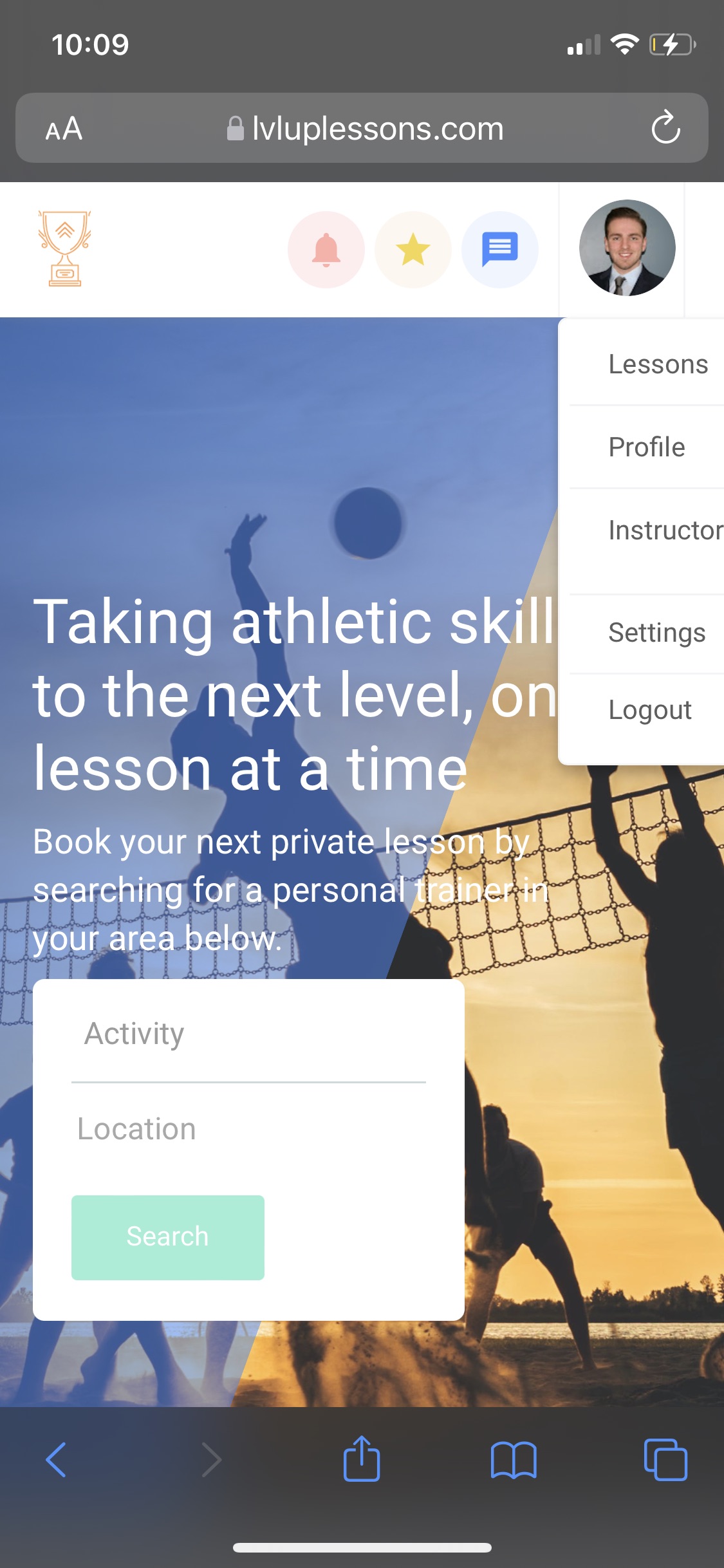
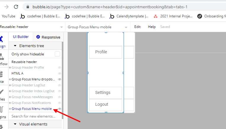
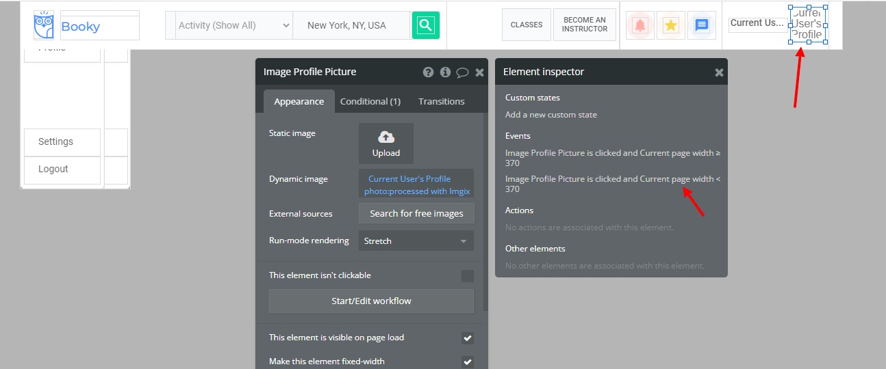
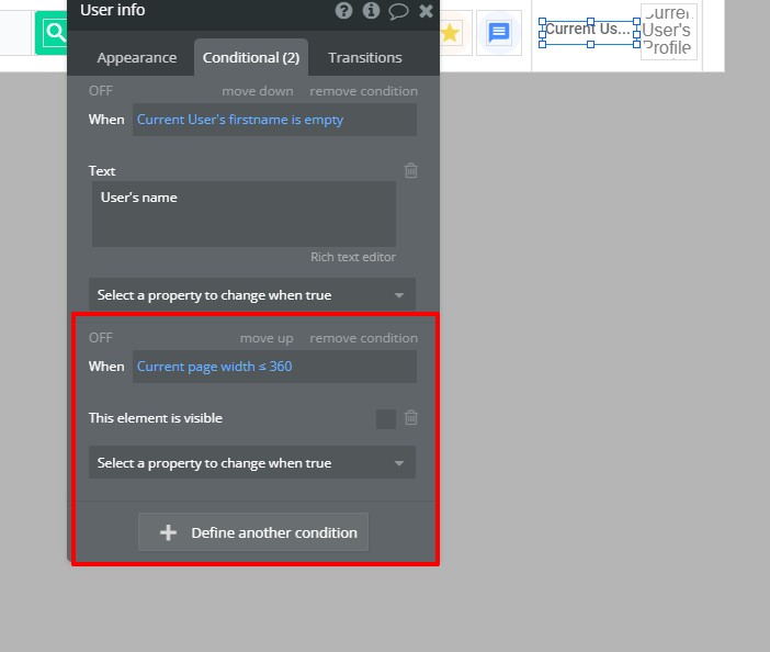
I’m currently using the booky template for my app but am running into an issue where the group focus boxes are being cutoff the screen when viewing on Mobile.

For example, the group focus “Menu Dropdown” runs off the right of the screen when toggled on mobile. I would typically adjust the offset for this but since group focus elements are not responsive, this adjusts for all screen sizes which does not present a nice UX.

I’ve created a work-around for now by toggling a floating group instead but would still like to know about the group focus issue above.

@anthony.woodard91,

Could you kindly tell us if you have switched your application to the new responsive mode? Since our template Bookly is working well on the old responsive engine, we assume this could be the root cause of the issue you have.

Please let me know if there’s anything else I can help you with!

Have a nice day! :slightly_smiling_face:

@diana.c

I have not switched over to the new responsive mode - I am sill using the old responsive engine. In your mobile demo, it functions the exact same as I described with the group focus being cutoff.

In addition, you can test this out in my app by creating a test user and when logged in, click on your Profile picture in the top right to toggle the menu. www.lvluplessons.com

Here’s a screenshot:

Hi @anthony.woodard91!

Thank you for specifying.

We checked the demo template, and, as you mentioned, after changing the width to a certain point it stops responding correctly.

We’ve reported the problem to our designers, however, fixing this may take some time.

Once a new version of the template will be available - we will let you know.

Thank you! :pray:

1 Like

Hello @anthony.woodard91!

I just wanted to give you a quick update - our team is currently working on fixing this, however, due to the developers’ workload, it is taking some time.

We want to make sure everything is rectified before deploying the template.

Thank you for your patience! :pray:

@diana.c Thanks for the update. Does your team have any type of eta?

Hi @anthony.woodard91!

I’m afraid we don’t have an ETA on that, as it depends on the developer’s volume of work.

Rest assured, as soon as any news will become available - I’ll update you!

Best regards,
Diana

Hi @anthony.woodard91!

Our team has fixed the issue you reported and we’ve deployed the new version of the template.
In order for the fixes to be visible, you will need to create a new app and select it from the “Start from a template” dropdown.

Please note that our responsive is usually focused on devices with a width of 375 and up, therefore, if you’re setting the responsive of your app to a width smaller than that - you might need to customize it manually.

Let me know if there’s anything else I can help you with. :slightly_smiling_face:

Best regards,
Diana

@diana.c

Thanks for the update!

However, creating a new app just to use the template is not an option for me as resetting all of the changes I’ve made in my current app would be cumbersome but also my paid plugins would have to be repurchased.

As an alternative, can you please share what your team did in order to make the group focus work?

Thanks

Hi @anthony.woodard91!

I’ve forwarded your request to our developers, once I have any updates - I will let you know.

Have a great day! :slightly_smiling_face:

Our developers have sent me the steps they took when fixing the bug @anthony.woodard91!

  • A new Focus Group has been created for the menu with a smaller reduction:

  • Сonditions for different screen resolutions. When the current page’s width < 370 - show Focus Group for mobile:

  • Hide Text When current page width < 360:

  • Changed the adaptive for all elements on the main page:

Hope this helps! :slightly_smiling_face:

Best regards,
Diana

@diana.c Thank you for providing this information!

I will give this a shot but the only thing I’m unclear of is your statement “Changed the adaptive for all elements on the main page.” Can you please elaborate?

Thanks,

Hello, @anthony.woodard91.

That means the page was adapted for 320px viewport and general elements alignment was made (some groups were aligned, centered, etc to make the page be more visibly attractive).

Please let me know if you have any additional questions.
:slightly_smiling_face:

Awesome - thank you so much! I will make these adjustments.

1 Like