Hi all,
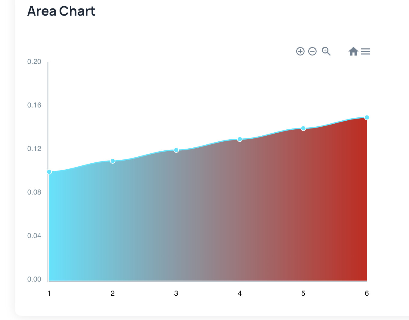
I have a bug appearing on the air line chart (area chart). When I plot decimals, the axis has some kind of internal floor function. A simple way to reproduce the issue is to plot the following:
x = 0,1,2,3,4,5,6
y = 0.1,0.11,0.12,0.13,0.14,0.15
And put the y axis decimals to 2. What you will get is this:
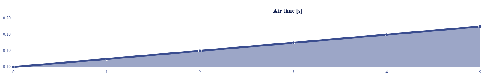
If we then add a min y value 0, the axis still looks ok, but if we now also add a max value, it shows the max y axis value crushed next to the normal “max” value that should normally be shown:
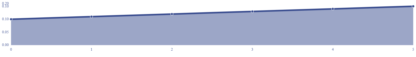
We’re using this chart in production so we would highly appreciate if this could be fixed as soon as possible. Thank you!