Hello @isaacshaw57 ,
Thank you for reaching out to us, and sorry for the delay over the weekend.
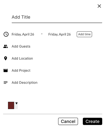
I’d like to remove the dropdown arrow and and grey border of the picker. Ideally the only thing showing up would be the color itself (as a circle, but I can figure that out), and when clicked - the palette comes up.
Another thing I’m wondering is if there’s a way to show the colors in the palette as circles instead of squares. I’d also like to remove the check mark and have a circle border around the selected color.
I’m glad to let you know that your request can be accomplished using custom CSS directly on your page.
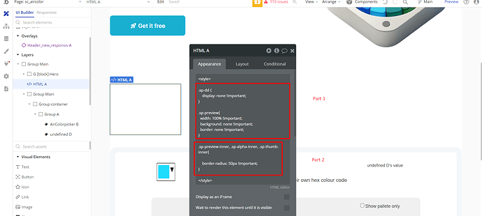
Alternatively, if you prefer a more straightforward approach, you can incorporate a pre-made HTML block into your page. This method is quite convenient and we have an example of how can this be achieved on our Test page.
Our devs created an HTML element that you can use as a starting point and customize and adapt it according to your needs.
The first part of the code will make sure to hide the arrow, While the second snippet referring to the border radius can let you adjust the roundness of color palettes.
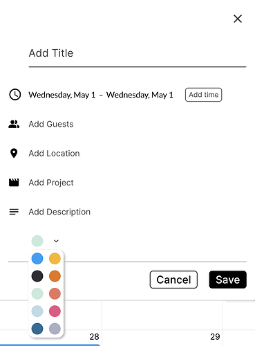
This is the end result, as previously mentioned feel free to customize and adapt this code on your side.
We hope that you will find these suggestions helpful.
Best regards, 
Zeroqode Support Team.


