
I have a scatter plot that I’m trying to set up using the Google Charts plugin and ran into an issue that I’m trying to resolve. Is there anyway to change the bottom axis so that it shows more data? Currently my x-axis only shows up to a certain amount and anything above that gets truncated at the far right side of the graph. Thanks for the help!
Hi, @mason!
Thanks for reaching out!
To help you better could you please share a bit more details like screenshots of the result you get and plugin element settings screenshots, and the steps to reproduce them. Thanks for understanding 
Best, Julia.
Sure thing! So I have a data type (Record) that has a several properties. I’m trying to compare the relationship between 2 of those properties (GRS & PSP). So what I have done, is created a sorted (by GRS, my x-axis) state field that holds the information I want to display.
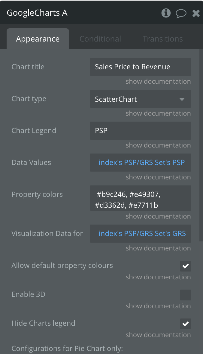
Then I set up a ScatterPlot Graph using this set of parameters:
And I am getting this result:
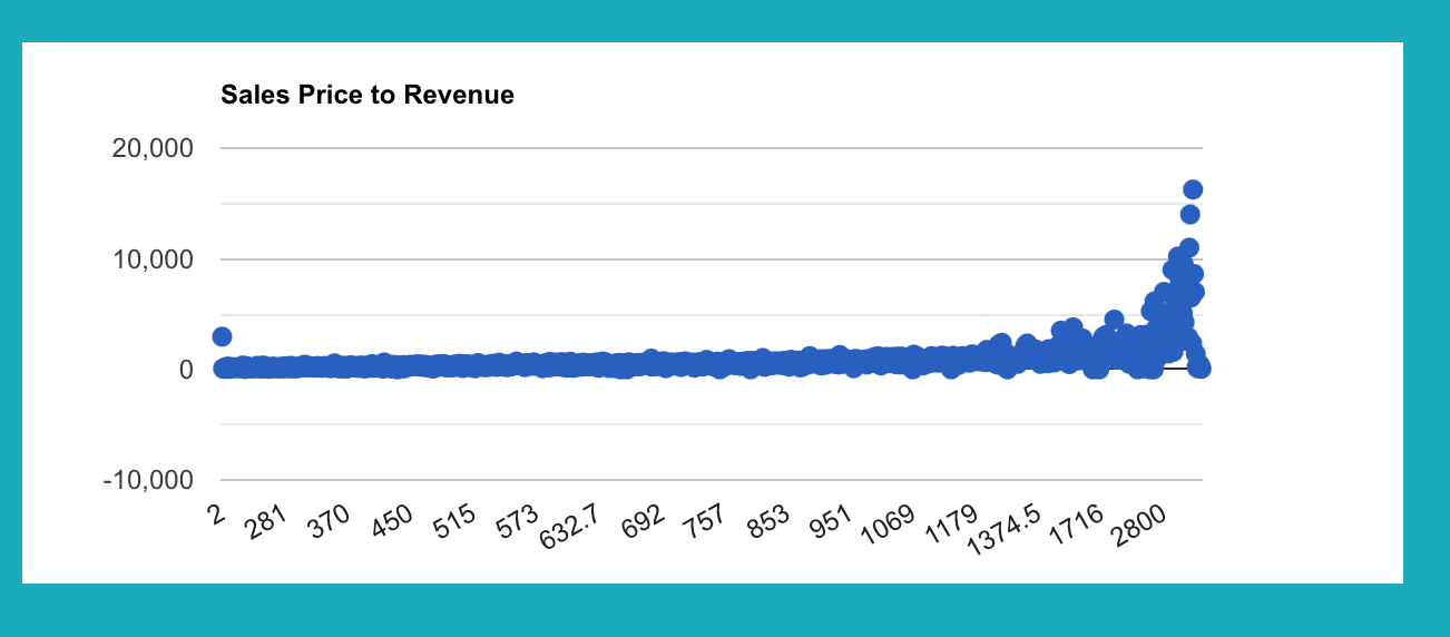
The issue that I’m running into is that while most of my data points fall in between the 0-2,800 range that is displayed on the x-axis, I’d like to adjust the scale on the bottom so that it displays evenly between the lowest GRS number and the highest. Right now, it appears that it is just showing where the majority of the data falls
Hi, @mason!
So, let me clarify a couple of things:
- The issue is that the points are mixed and you’d like to see them arranged one near one?
- The second issue is- that the x-axis gets truncated in spite of the fact that there is more data to show? It means, there is more data that is above 2800, but isn’t shown?
Looking forward to hearing from you!
Best, Julia.