Hi @Igor - thanks for your reply.
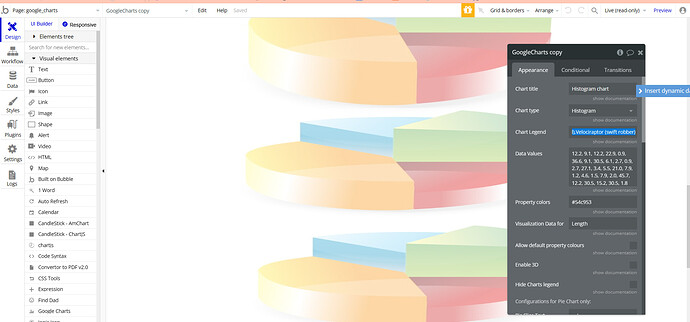
I’ve actually made some progress since my post and can now generate a basic histogram, but am still curious as to how it can be customized and how the settings are supposed to work.
The app is a forecasting game, where player’s entry (an unbounded but positive decimal) is assigned a score (a decimal between 0 and 100).
I’d like to display histograms of both the entries and the scores. The data for each is just a single list of numbers (the length of the list is variable, depending on how many entries there are). But for one chart (the scores), the x-axis range will always be 0-100; for the other, it will depend on the forecast ranges.
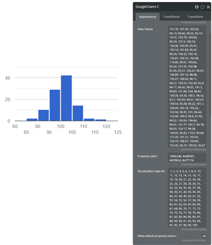
To learn how the settings impact the presentation, though, I’m just using sample data (a list of 100 static values, generated from a normal distribution with mean 100). This screenshot shows how the chart is currently set up. It seems that it won’t display anything unless the “Visualization Data” field has a list of exactly the same length as the “Data Values” field, but it doesn’t seem to matter what values are inputted in the “Visualization Data” field. I can re-paste the Data Values; I can use 1, 2, 3, 4… 100; I can use gibberish. It seems to have no impact on the resulting chart.
Can I, for instance, change/override the number and width of the bins? Change the y-axis to display % of total items in each bin (rather than the count of items per bin)? Would also like to be able force x-axis labeling, as that disappears when the chart is presented in small format. And to learn whether Visualization Data plays a role in this chart type.
Thanks again for your help!


