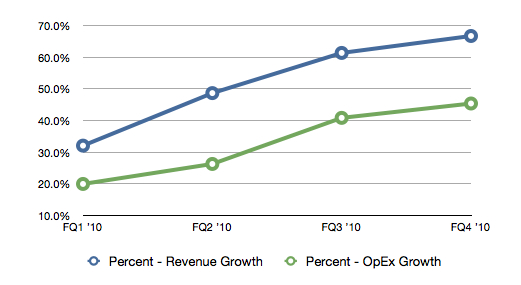
Services Plugins FAQs

Google charts - multiple series of data

Hi @kate,

I’m trying to work out whether the combo chart is what you would use to display 2 or more series of data on the same chart. Example revenue vs. expenses.

If so, could you please provide some info on how to format the values and properties fields to show 2 data series’?

If not, is there another way to do this?

the outcome I need is a graph like below:
image

Regards,
Mihira

Hello, @mihira. Thanks for your question.

I will check if 2 different value types can be used at the same time in the Line Chart, or if there any alternative and get back to you asap.

Thank you for understanding :pray:
Regards,
Kate

@mihira,

I have looked for the ability to display 2 different values at the same time, using the Line Chart. Unfortunately, the current plugin setup does not allow this feature.

We will consider this point as a possible update of the plugin and see how feasible it is to be implemented in the future, but currently, I can not commit on a time-frame.

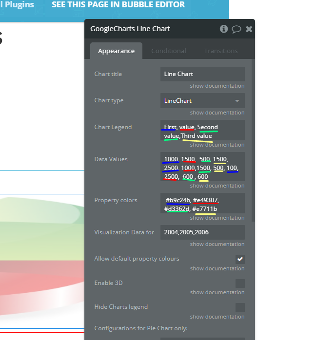
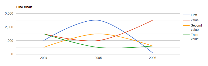
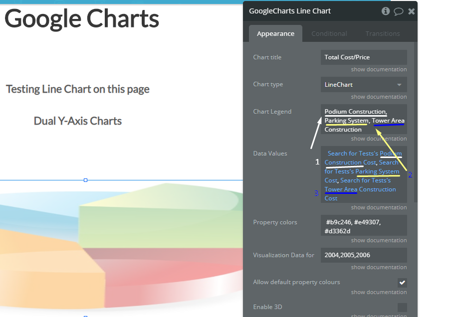
Also, the possible workaround for your situation is using 2 Line Chart elements at the same time with the specified conditions. Please take a look:

  • create 2 Line Charts, one for (example) Revenue and the second one is for Expenses, and put them on the same place within a group
    Revenue Line Chart | Expenses Line Chart;
  • set the data source for the Revenue and Expenses charts respectively;
  • make one of the Charts invisible on the page load - Expenses, for example;
  • add the toggle or checkbox (it’s up to you) and set the following workflow:
    • when the IconicToggle A’s value is changed and Only when condition is set to IconicToggle A is checked and the Expenses chart is not visible - hide the Revenue chart and show Expenses chart;
    • when the IconicToggle A’s value is changed and Only when the condition is set to IconicToggle A isn’t checked and the Expenses chart is visible - hide Expenses and show the Revenue chart.

Take a look at how does it work in the preview:
https://www.loom.com/share/bb8822c13fc948f1b025b8755b143727

I hope this will be useful for you :pray:
Regards,
Kate

Hi @kate,

I appreciate the effort you have taken to create the video and the example.

However, it defeats the purpose of the chart as the scale is different and is not as useful as having two data series visible for comparison on the same time and value scales. What you have demonstrated can be done with the free bubble chart plugin as well so, to be honest I’m a little disappointed in the plugin.

Again, I do appreciate YOUR help. Just not what is typically expected from a paid plugin.

Regards,
Mihira

@mihira,

You are always welcome :slightly_smiling_face:

Apologies for the mismatch of expectations with the real functionality of the plugin. :pray:
As I have said, we will consider of adding this functionality to the plugin in the future update, because your suggestion has a good point. Thank you for your feedback and support.

Regards,
Kate

1 Like

Thank you. I look forward to the update

1 Like

@mihira, it’s been a while :slightly_smiling_face:

I’d like to inform you that we have made a plugin update - now you can indicate an unlimited number of values, using charts.

Please pay attention to the way you should use this plugin:
- for static values


Please update your plugin to the latest version and give it a try. Hope you like it! :slightly_smiling_face:
Regards,