Services Plugins FAQs

Google Charts plugin splitting words based on “,”

Hi,
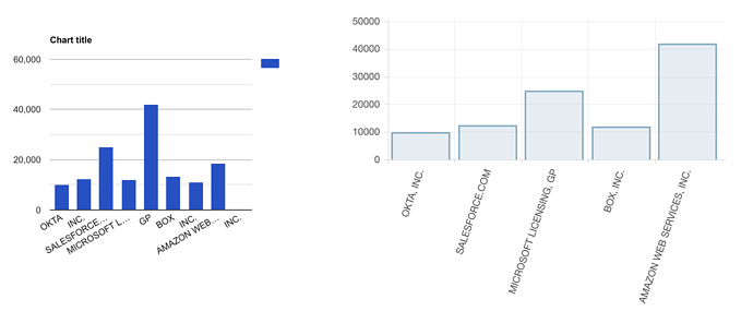
Fairly new to Bubble and been developing in Bubble for the last month or so Bubble experts who can help, greatly appreciated. I recently subscribed to the Google chart plugin and was trying to chart company names on the y axis and I noticed that its splitting it based on the fact there’s a “,” or “.” in the company name. When I chart the same data using Bubble’s chart plugin, it seems to chart it fine. Anyone have ideas on how to resolve this?

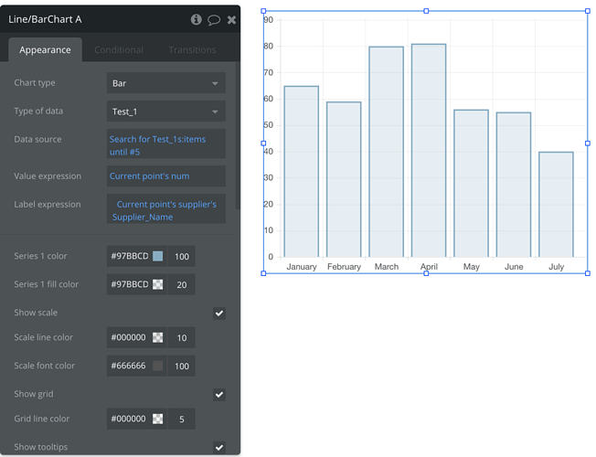
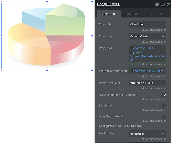
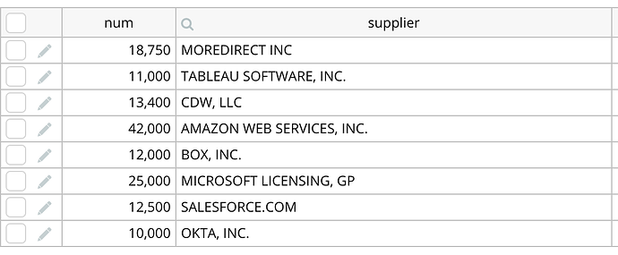
For purposes of illustration, I’ve charted everything in column to show a side by side comparison. Snapshots of my design and test data to showcase.

Hello, @jimmytu0. Apologies for the late answer :pray:

You did everything right in your chart setup.
But unfortunately, you need to remove the commas from your table (list of supplier names) because the Bubble editor recognizes the comma as a separator for the name values. And, as a result, causes this display issue.

I hope this helps.
Regards,

Hi @kate. Thanks for the response!
I thought I had done everything right and am glad to get that validation.
I do, however, need to have the commas in my table as I am capturing company legal names as to how they were registered as a business entity. I’ve managed to find a workaround by using a regex to extract the text prior to any commas or other characters as such.

In any case, thanks for your response!

1 Like