
Im using the google charts plugin. All fine with the exception that unlike all the other chart options im unable to apply a different colour. Is this me using the chart in corretly. Also is there any reason why there is no Column chart… This is not a compliant or bug… i subscribed knowing there was no Column chart. just interested as to why ?
we’ve just selected the most popular charts, because Google has tons of them and we couldn’t add all 
1 Like
@Bubbleboy hello!
To add to what Levon said, regarding the color change for charts it can be done by going to a plugin property editor and in the property colours input change the color you’d like.
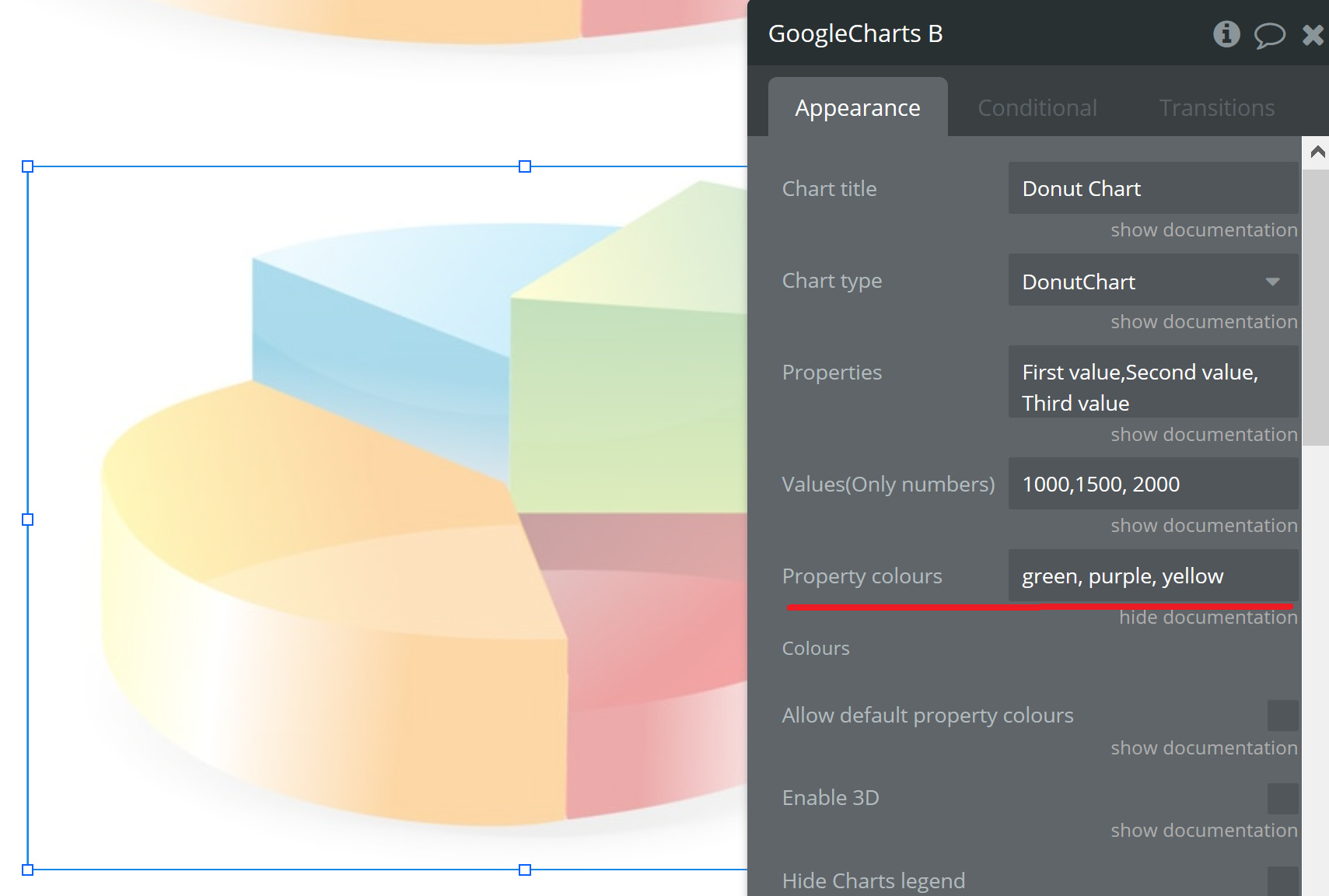
Please check this out! Thanks.
Regards,
Dumitru.
1 Like
@Dumitru thanks yes i understand how to ajust colours… my comments was that this works for all charts but not the bar chart.
Hi @Bubbleboy.
I see, thanks for reporting. We’ll check this out.
Update
After checking the plugin works this way for bar charts cause it uses the same series data structure present in the Google’s Charts.
https://developers.google.com/chart/interactive/docs/gallery/barchart#bar-styles
Not possible to make changes in style for Bar Charts in Bubble, unfortunately.
However we improved the plugin with additional features in the latest version so please check it out
Thanks for understanding.
Regards
Dumitru.
1 Like
Odd that you missed out the Column charts as that is probably the most used graph type of all time. It would be great if you could add it in a future update, as at the moment I’m having to use your EXCELLENT plugin for some of my graphs and then another plugin for all the normal column charts.
It would be doubly amazing if you could add in the column charts with trend lines that Google features, but I totally understand that’s taking things to a whole other level
Thanks for the great plugin as it is though. Love it!
3 Likes
Hi @Siddhartha,
We updated the plugin and now it is also possible to make: Line Chart, Column Chart and Stepped Area Chart. You can see how the charts look here: https://zeroqode-demo-01.bubbleapps.io/google_charts
Regards,
Alex
That’s great news Alex. You guys rock!
2 Likes