 Help with AirChart Pro - Alignment of data series/categories
 Context Creating a bar chart showing the number of invoices by status for each establishment, filtered by the connected user’s brands. The data between categories and my group by don’t match so there’s a mismatch… I don’t know how to make this kind of graph and I’m completely stuck… Maybe another way to make queries and link everything…
I made a vocabulary index for a better understanding french to english.
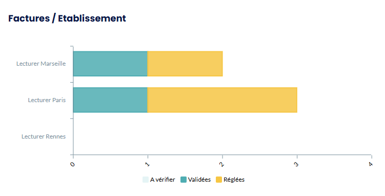
Here’s how it looks:
 DB Structure • Invoices Table → Client Status (“To verify”, “Validated”, “Paid”) → Relationship with Establishment
• User Table (Office) → Multiple relationship with Brand table
• Establishment Table → Name (text)
• Brand Table → Name → List of establishments (multiple relationship)
 Graph Objective
- X Axis: List of establishments
- Y Axis: Number of invoices
- 3 series by status
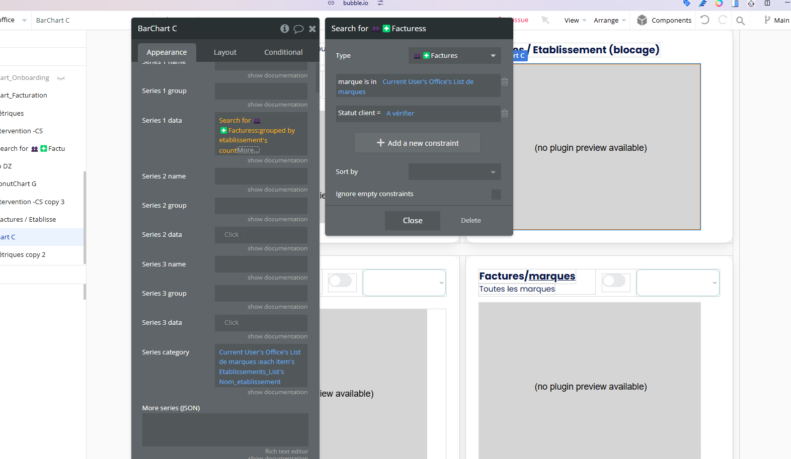
 Current Configuration Series Category:
current user brand list establishment list’s establishment name (text list)
Series 1:
Search for invoice constraint: brand constraint: registered Grouped by establishment Count aggregation
Series 2 & 3: Same with status change in the constraints
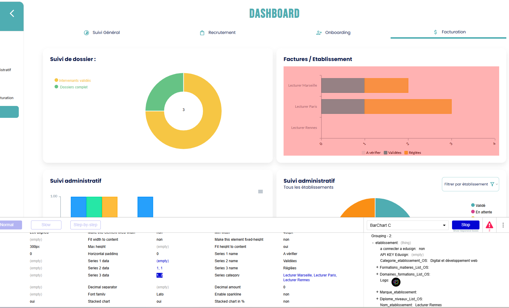
 Problem See screenshots:
• Graph: misaligned data •
Inspector: data present but wrong matching
 Questions
How to properly align data/categories? Better structure for groupings?
Notes •
Plugin: AirChart Pro •
DB truncated for example •
Screenshots = test data
Thanks in advance for your help
 Index Vocabulaire Français → English
Base de données / Database:
- Facture → Invoice
- Établissement → Establishment
- Marque → Brand
- Utilisateur → User
Statuts / Status:
-
À vérifier → To verify
-
Validé → Validated
-
Réglé → Paid
-
Enregistré → Registered
-
Liste → List
-
Relation → Relationship
-
Relation multiple → Multiple relationship
-
Contrainte → Constraint
-
Groupé par → Grouped by
-
Agrégation → Aggregation
-
Nombre → Count
-
Graphique en barres → Bar chart
-
Axe → Axis
-
Série → Series
-
Catégorie → Category
-
Liste de marques → Brand list
-
Nom établissement → Establishment name
-
Liste de texte → Text list
-
Rechercher → Search for
-
Utilisateur actuel → Current user
Uploading: Capture d’écran 2025-01-29 190957.png…