Services Plugins FAQs

Need help please! Issues with the free Bar chat plugin

Hello everyone

I need some help with the free bar chart plugin (Air chart lite) that I am using in bubble.

I have a data type (Payments) that has fields including a Status (Paid, Unpaid, Draft) and a reference to another data type (Category). I am trying to create a stacked bar chart grouped by Category where Series 1 is for Unpaid Payments and Series 2 for Paid Payments.

I can’t get the Category mapping right, can someone help please please please?

Thanks a million in advance!
Tiph

Hi @tiphaine,

Thank you for your message and for using our plugin. :pray:

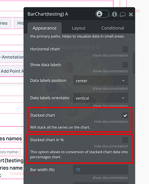
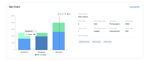
If you want to create a Stacked Bar Chart you can scroll down the element till you find the checkbox “Stacked chart” and chose it, here you can also select the next checkbox “Stacked chart in %” if you need it.


In case you have any other questions, could you please provide more details? You can also check out our Live Demo to see how it works.

Hope everything works out, waiting for your response. :raised_hands:

Best regards,
Stephan

Hello Stephan,

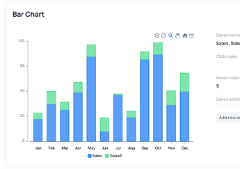
Thanks for your response! I did manage to create a stacked bar chart without issues but I have issues mapping the data to the right Category. I also had a look at the Live Demo but the data they are using is different than mine (it always has the exact same number of Data in each Series while we don’t necessarily).

Let me give you some more context:

  • I have a data type called Payment; it has multiple fields including Status (type: Text; Paid, Unpaid, Draft) and a reference to another data type called Category (that has a Name, etc).
  • I am trying to do a stacked bar chart where Series 1 is Unpaid Payment and Series 2 is Paid Payments, with the Series Categories being the Payment’s Category’s Name.
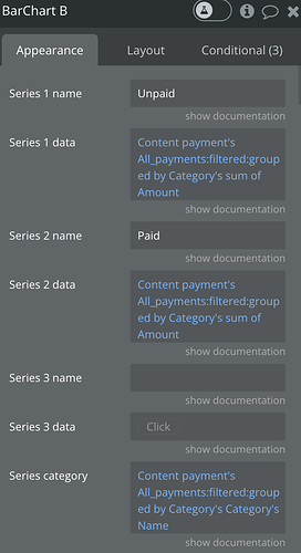
  • I am successfully getting the Sum for each Series but I have issues mapping those to the right Category name. I think it’s because each Series’ Data is being transformed to a List of Numbers, thus it doesn’t know which Payment is associated to which category.
  • In the screenshot below, you can see that Series 2 has less data than Series 1. Instead of properly mapping the data to right the category, it just assumes that the 1st Data is for the 1st Category, 2nd Data for the 2nd Category, etc.

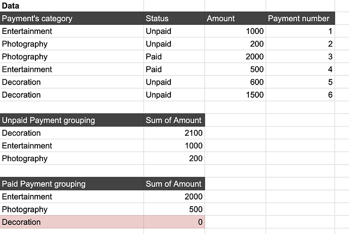
  • I have added a screenshot of an excel spreadsheet to further illustrate the issue

Let me know how I can solve the problem!

Hi @tiphaine,

Thank you for providing further details. I will now demonstrate how you can achieve your desired outcome with the information given:

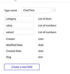
Make sure to create the table with categories and values in the form of “a list of text/numbers”.

When creating sample data, every category has two values: one for paid and one for unpaid.

With these steps, you can achieve this table,

Feel free to revisit the Demo page if you need to create something more complex.

I hope that the information I provided was helpful to you. I am eagerly awaiting your response.:pray:

Best regards,
Stephan