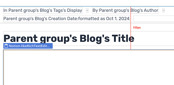
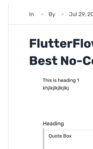
Hi, I have added the Notion Editor to display content on a page.
There is no margin or padding that I applied to the element or group but
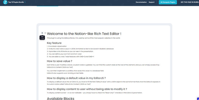
There seems to be still some padding applied of about 40px to the element which causes it to be indented, see the screenshots. How can I remove this?
Thank you for reaching out!
We thoroughly tested the plugin Live Demo Page on our end and were unable to replicate the issue you described regarding the extra padding. Additionally, based on the screenshots you provided, I attempted to recreate a similar setup on my side, and in both instances, the plugin element worked as expected.
To help us better understand what went wrong on your side, could you please provide more details? Specifically, it would be helpful if you could provide:
- The type of device and operating system version you’re testing on and the version of the plugin you have installed.
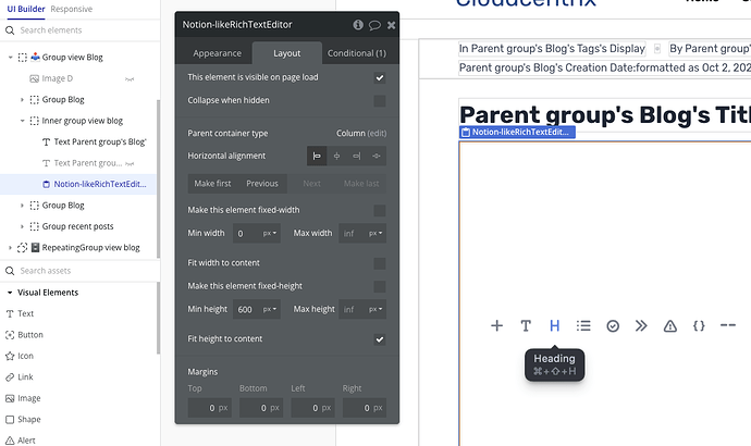
- Share a screenshot of the element tree so we can see how the Notion Editor is structured.
- Confirm exactly where the padding appears (e.g., between the blog title and the plugin or between the plugin and another group).
In the meantime, feel free to check out the plugin Editor Demo Page and the supporting documentation for a successful plugin integration.
Looking forward to your response!
Best regards,
Mina
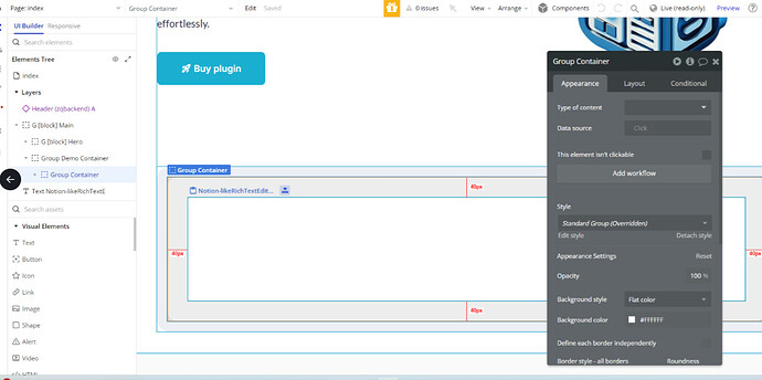
Here is a screenshot of the element tree. You can see it is in the same group of the Title, that doesn’t have any indentation.
Version 1.57.0 latest
Chrome / Macbook
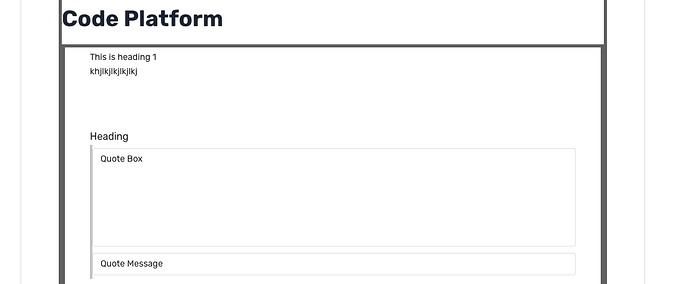
I have put borders around the outer group and a border around the notion RTE to see where the padding is coming from. You can see it looks like there is padding within the RTE.
Thank you for your reply and for providing the additional screenshots.
I’ve double-checked the live demo page and confirmed with the dev team that the element has a default padding that comes from the library used. You can also check this on the demo page here
As a workaround, you can try adjusting this padding using custom CSS on your page, but please note that modifying it might cause the buttons to either move outside the RTE or overlap with another group.
If you were referring to something else or had a different issue in mind, feel free to let us know, and we’d be happy to assist further.
Hope this helps!
Best regards,
Mina
Thanks for the reply.
As you can see in my original screenshot, I am referring to the display of the content, not the editor. When it is in read-only mode, there are no buttons, so that’s not the issue. The issue is displaying the text is indented. I have a workaround to add -40 left margin, but that is not great and I don’t understand why it would be applied.
Thanks for your update!
Sorry for the misunderstanding. Just to clarify, the extra padding you’re seeing when displaying content comes from the library used for the Notion RTE. This is why the content appears indented, even though you haven’t applied any additional margin or padding yourself.
Regards,
Mina
I just wanted to follow up on my previous message. Were you able to review the information I shared about the extra padding? If you have any further questions or need assistance adjusting the layout, feel free to let me know!
Looking forward to your response.
Best regards,
Mina
I have to add negative margin, which is very unhelpful.
Please remove the padding or add an option to remove it.
Hi @martinarbtergessner ,
Thank you for your reply.
I’ve double check with the dev team in regards to the space inside the element (Notion RTE), it is not recommended to remove or change it. This space is essential for the buttons (tools) that are not always visible, and modifying it could affect the functionality of the editor.
If you have any other questions or need further assistance, please don’t hesitate to reach out to me 
Thank you for your understanding.
Regards,
Mina
Hi Mina,
As explained, the issue is with the read only mode.
There are no buttons in read mode.
The margin should be removed and the plugin fixed.
Thank you for your confirmation, and apologies for the delay.
I’ve double-checked with our dev team regarding removing the padding in read mode only. Unfortunately, it’s not possible as this padding comes from the plugin’s library.
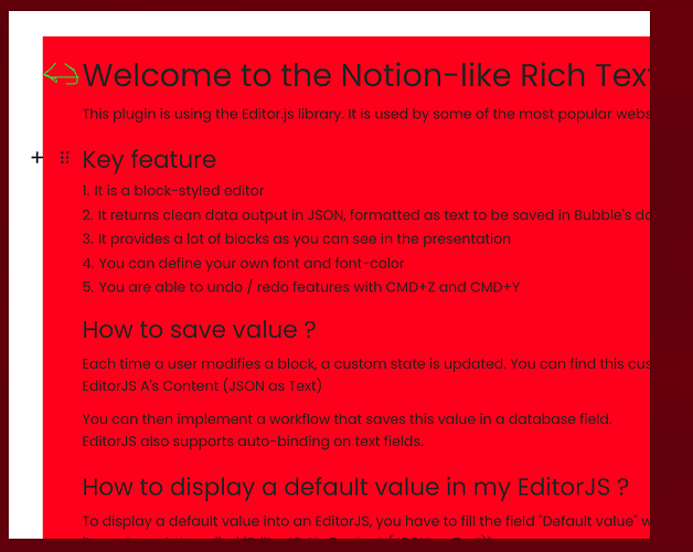
For a clearer understanding, please see the screenshots below where the element borders are highlighted. The red container you’re seeing is part of our plugin, and the padding between the text and the edge is applied directly by the library.
As was mentioned earlier, you can adjust the padding via custom CSS to better suit your design.
If you have any other plugin-related questions, feel free to reach out.
Wishing you a great weekend ahead 
Best regards,
Mina

