Thank you for your patience @ratko.petrovic
My colleagues and I have carefully analyzed the work of the plugin, specifically - the scatter chart for your use case. First of all, we would like to advise you to pay attention to the following:
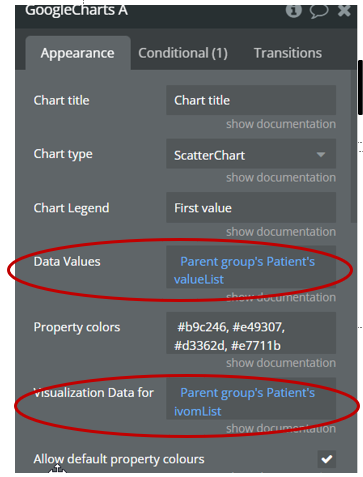
- If you use dynamic values in the fields “data values” and “visualization data for …” - please pay attention that the number of values in these fields is multiple. which means if you have 2 values in the “data values” field, then the values in “visualization data for” should be respectively 2, if you have 3 values in the “data values” field, then the values in “visualization data for” should be 3 and so on, respectively.
- If you use 1 value in the “chart legend” field, then all values in the “data values” field will be assigned to it. Please note, the first step mentioned above has to be followed.
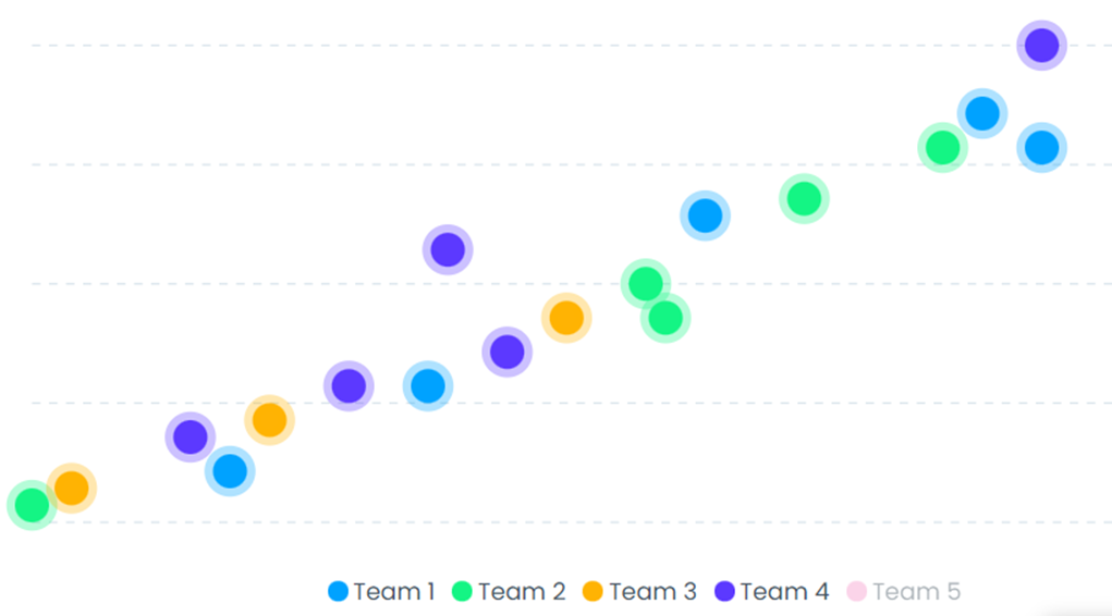
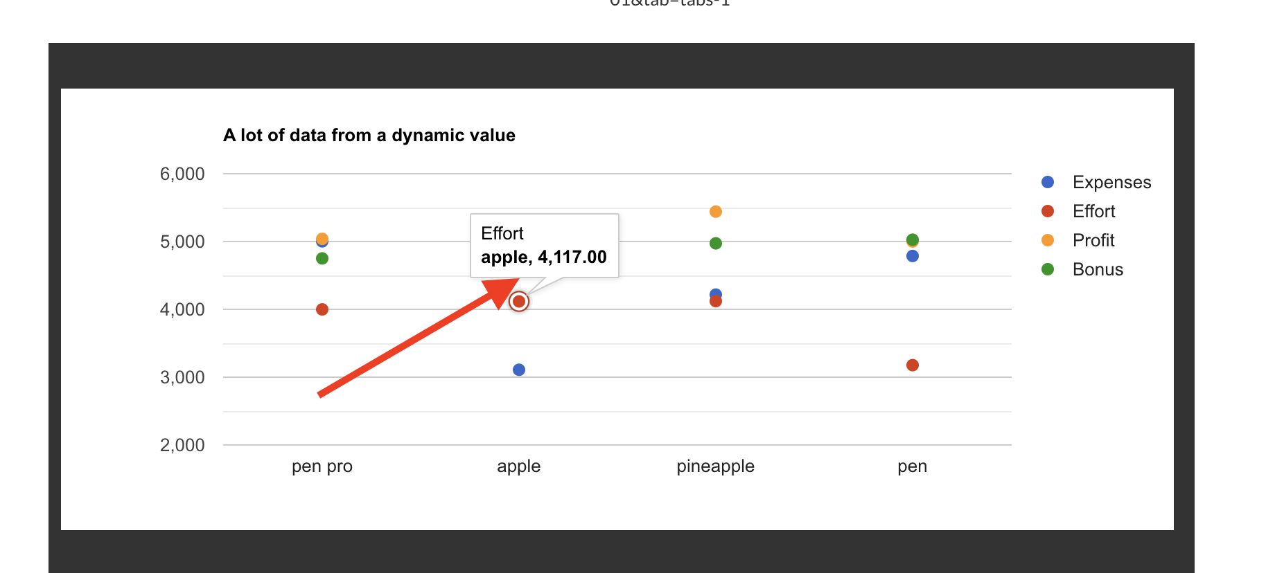
- If you use more than 1 value in the “chart legend” field, then the separation of values in the “data values” field is based on the matrix principle, see here. The values in this field are assigned by your values in the “chart legend” field one after another, in order to visualize the question, we have created this test page for you. Please have a look at it here: https://zeroqode-demo-01.bubbleapps.io/version-test/kv?debug_mode=true
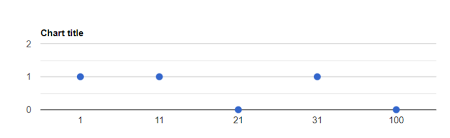
As for the screenshots that you sent, it can be seen that in the “legend of the diagram” you have only 1 element. Therefore, the plugin displays the values only for 1 element (all the values on your screen are blue and belong to the first value). If you would like to display more values in the chart, I would advise you to add more values to the “chart legend” field.
Hope it helps 
Please let me know if you have any other questions.