Hello,
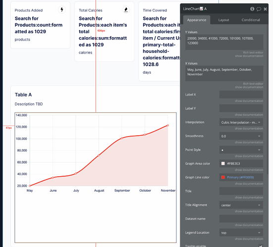
First time posting here. I am trying to create a table that shows an accumulation of value over time. It’s must like a networth chart with a financial institution like Empower/Personal Capital or Wealthfront.
I need help with a few things:
- I am having trouble making this chart responsive.
- For the x-axis, I want it to show the last 12 weeks/months. When someone is new, we only have recent data so the table will likely be a straight line until we capture more data over time. How do I set up my database to capture this correctly? How do I set up my x axis to dynamically put the right range in for each user?
Plugin being used: Airchart Lite


