
Hi, I’m using the Airchart lite plugin. I have produced a bar chart (monthly on x-axis), where some months are a positive figure and some are negative. I need to be able to show positive bars above a zero line and negative ones below it (if positive can be green and negative red, then even better). How can I do this?
1 Like
Hi @debbie,
Thanks for reaching out.
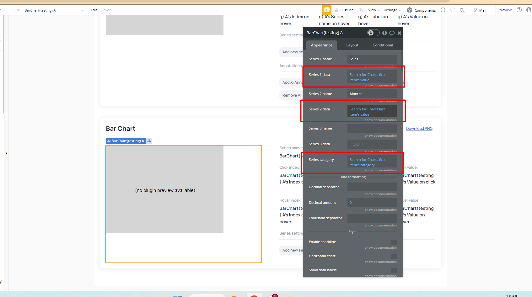
You can achieve your use case by using two series of data sets, each marked with a distinct chart color.
The first dataset will represent positive values and will be marked in green, while the second dataset will represent negative values and will be marked in red.
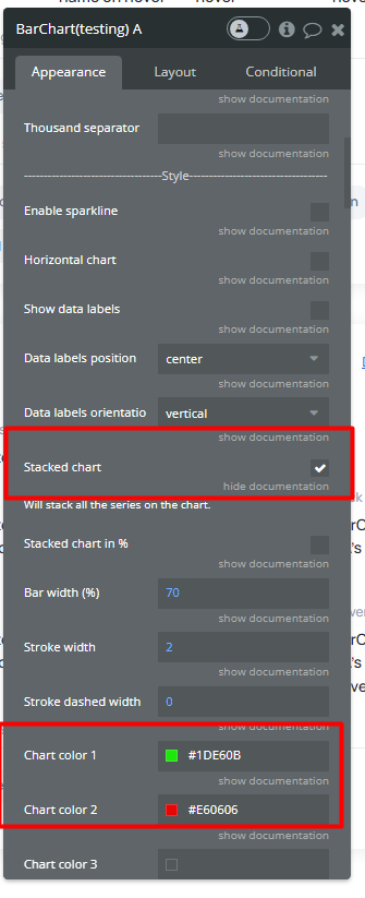
Also, please check the Stacked Chart checkbox to stack all the series on the chart.
See the screenshots below:
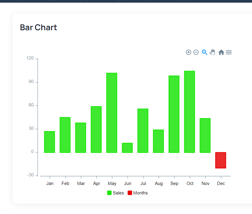
We’ve tested this approach on our end and it has proven to be effective. 
For your reference, you can view our test demo page.
Additionally, I recommend reviewing the plugin documentation for more comprehensive details and instructions on setup.
I hope the above will be useful to you. 
If you have additional plugin-related questions don’t hesitate to let me know.
Best regards,
Daniel
Hi Daniel, thank you for getting back to me. Unfortunately, this approach doesn’t work, because this is one set of data. So, for each month, the value may be positive or negative…the example has two lists of data where items in series 2 (negative) have amounts of 0 in series 1, whereas mine is one set of data. Any suggestions appreciated! Even having a zero line going across the graph would be useful, to help the user see which points go below zero.
1 Like
Hello @debbie!
Thanks for getting back to us.
Unfortunately at the moment if you have just one series of data with positive/negative values it will set just one color for the whole series of data.
We’ve verified with the dev team and checked the plugin library and it is necessary to add an improvement for the plugin in this matter.
We will create a task for our development team to look into adding this feature in a future update of the plugin.
Unfortunately, we cannot provide any timeframes due to a high volume of other tasks our dev team is working on. However, we will make sure to keep you informed about any updates.
Let us know if you have other plugin-related questions.
Have a great weekend ahead.
Regards,
Daniel
Hi Daniel,
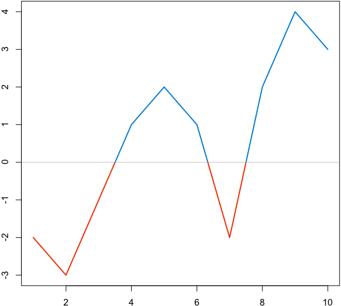
OK, thank you for letting me know. As a potentially quicker fix it would be useful to have the option to show a “zero line” that goes across the chart, so that it’s easy to see which values are positive and which are negative. A bit like this one:
1 Like
Hi @debbie,
Thank you for your suggestion! I will pass your feedback to our development team and they will assess its feasibility for inclusion in future plugin updates. We appreciate your input and will keep you updated on any progress made in this regard.
If you have any more ideas or need further assistance, please feel free to share.
Best regards,
Daniel
Hello @debbie, 
Great news! We’ve added a Range section for the Bar Chart element in new version. Please upgrade the plugin to the latest version and give it a try! 
However, I’m sorry to say that we’re unable to add a “zero line” separator in the chart, as the current library we use for the plugin doesn’t support this feature.
If you have other questions, don’t hesitate to reach out.
Best regards,
Daniel.
Hello Daniel
Thank you for getting back to me!
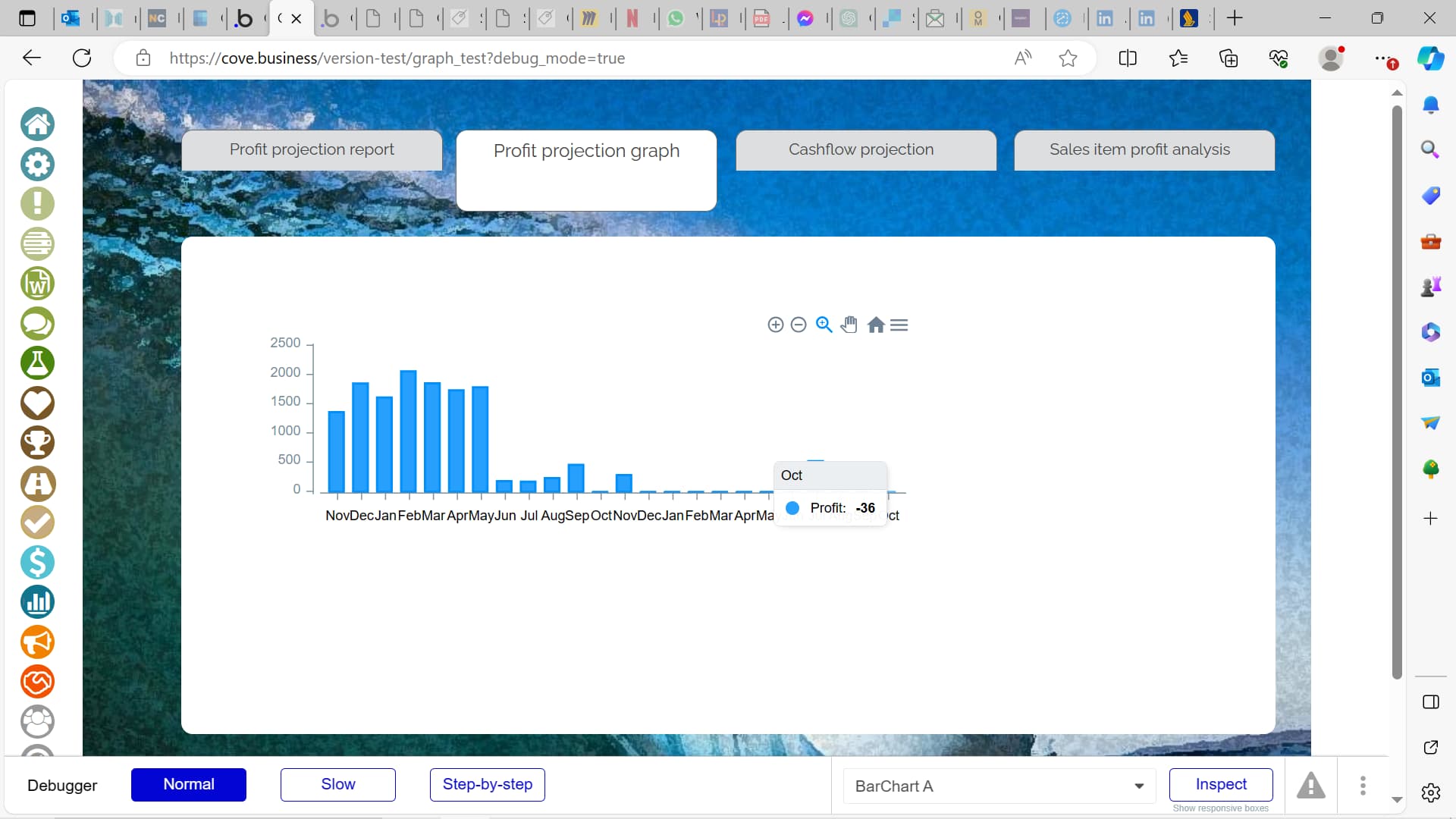
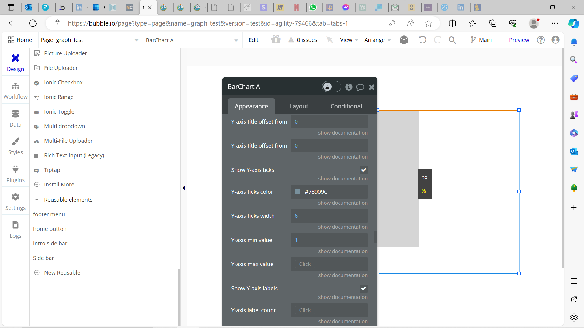
If it’s the Y-Axis min value, then unfortunately it’s not working properly:
- if I set to zero, it’s just ignored
- if I set to 1, then the Y-Axis starts at zero, but data with negative values is still shown, see below:
1 Like
Hi @debbie!
Thank you for providing the screenshot and additional details. I’m sorry to hear that you’re experiencing issues with the Y-Axis settings.
We’ve attempted to replicate the issue on our side but haven’t been able to reproduce it. To assist you further, could you please send us the screenshots of the settings of your plugin element? Additionally, if you could share any other information that might help us recreate your setup, such as the data source and conditions you’re using, it would be greatly beneficial.
Thank you for your cooperation!
Best Regards,
Daniel.
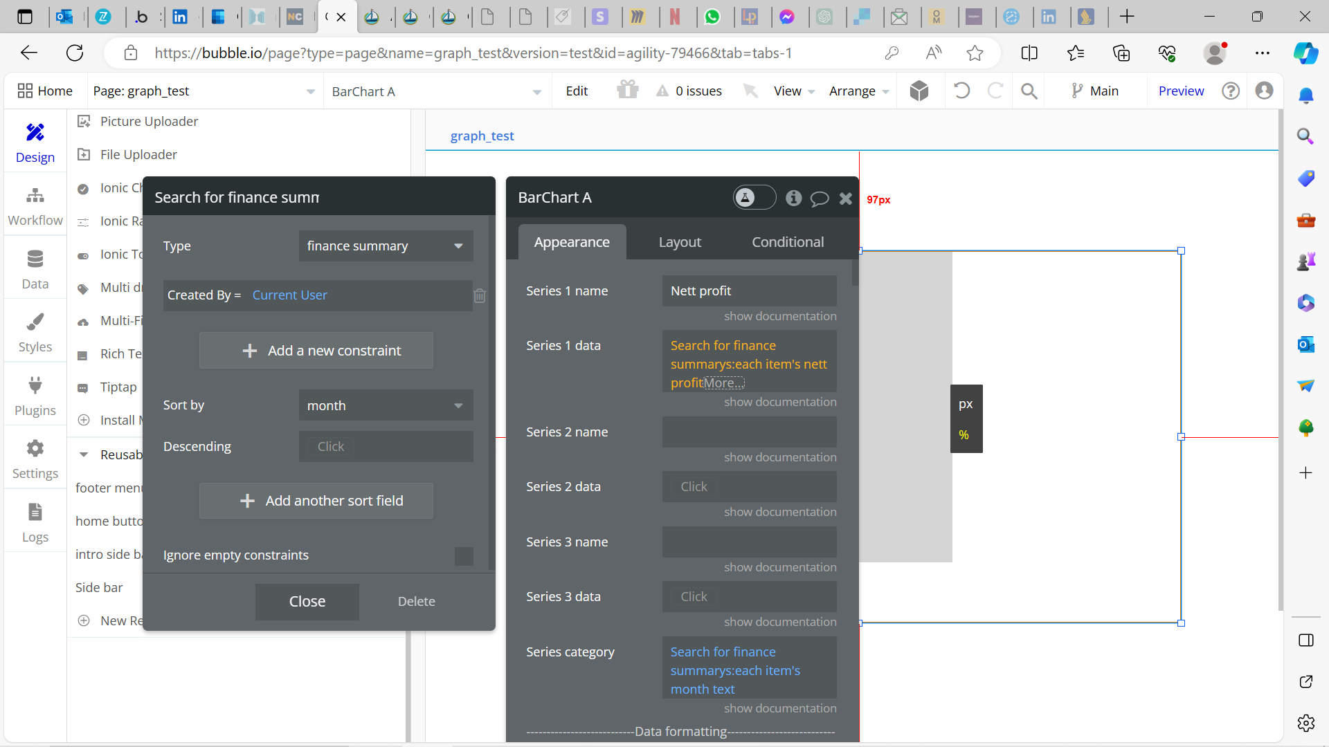
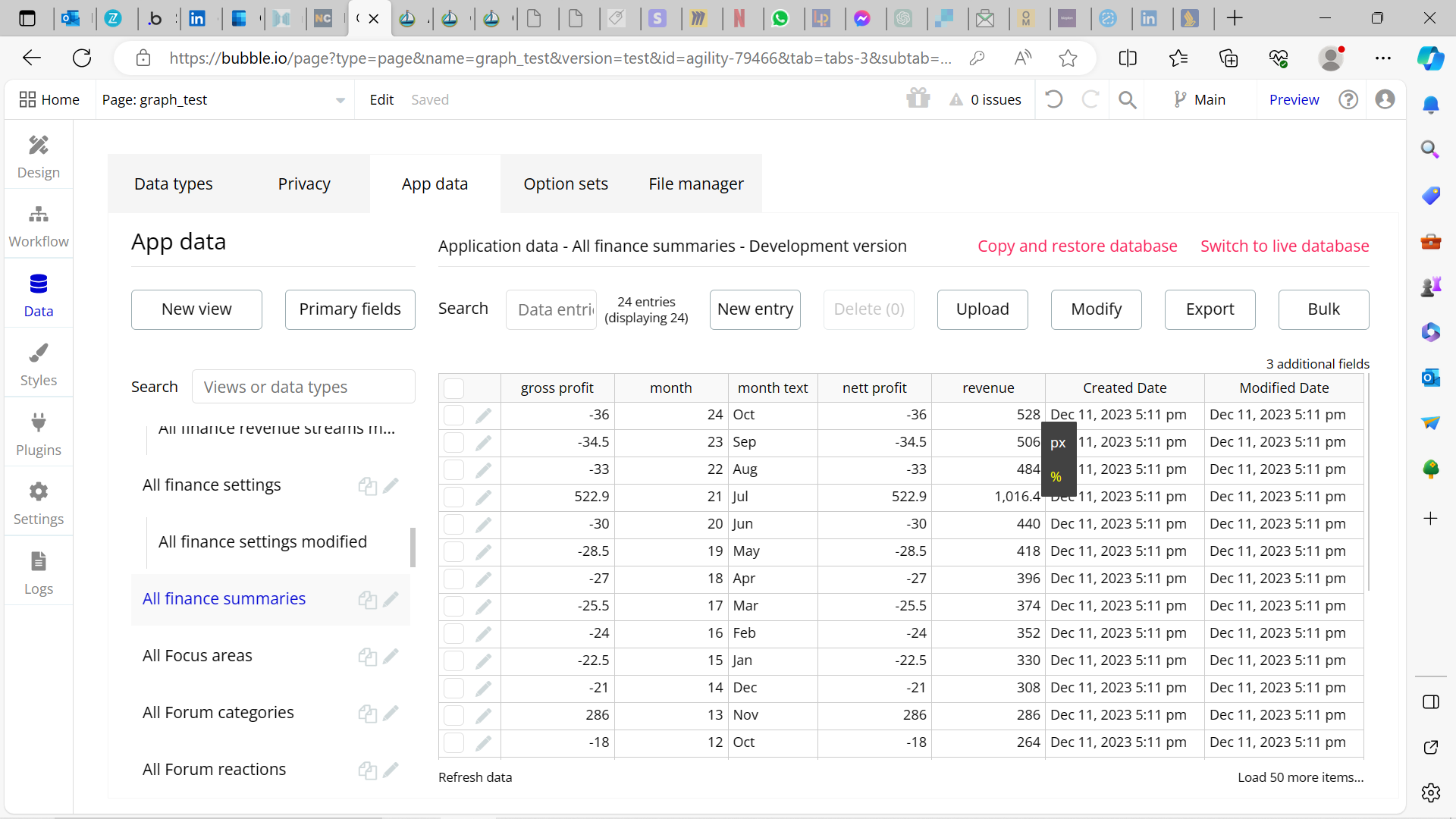
Hi Daniel
Please see below.
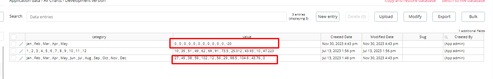
- the data source I’m using
- this is the actual data
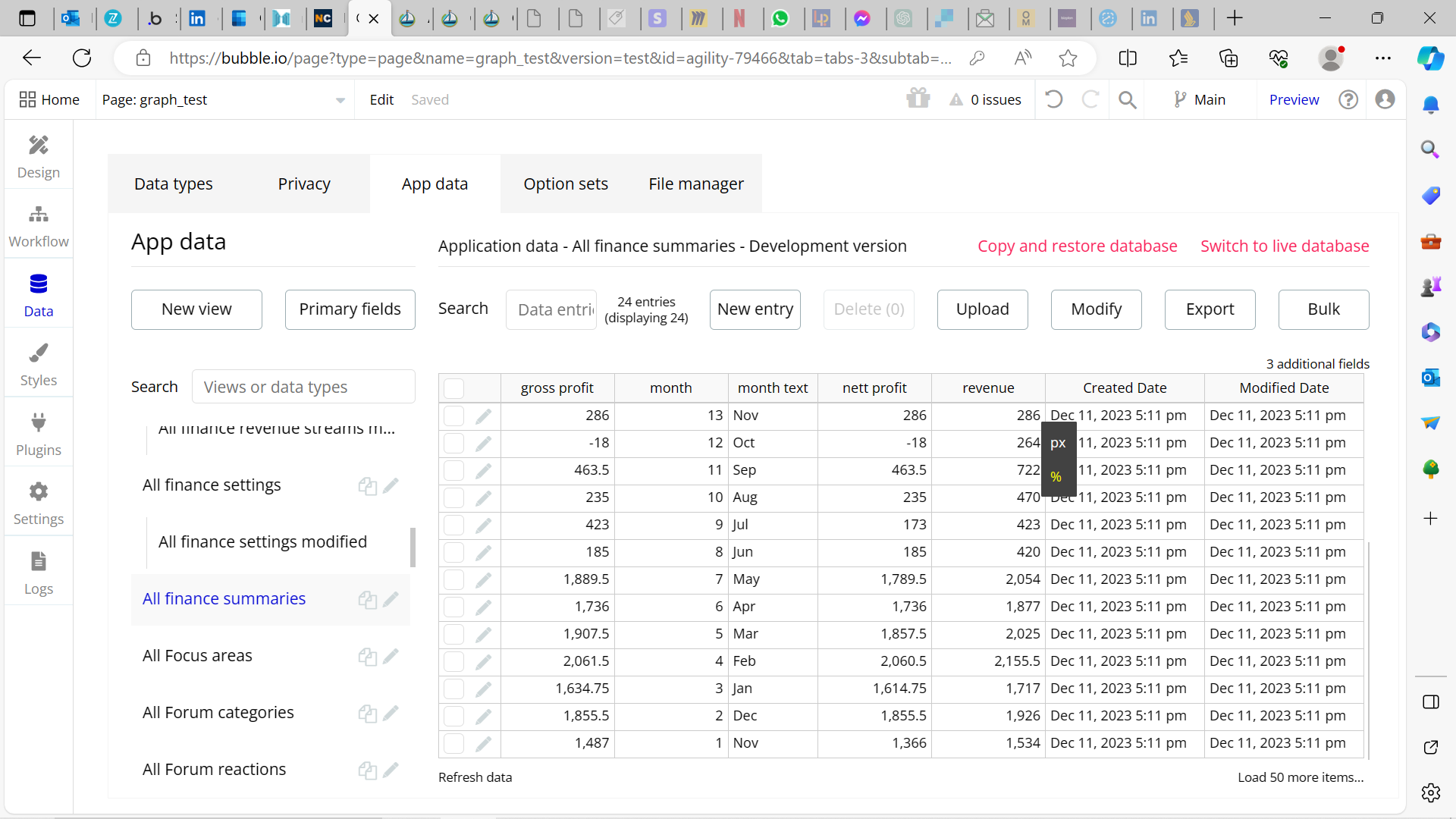
- here’s the y-axis setting, I need to put the value 1 as 0 doesn’t do anything
- this is the result - negative values are still showing
Thank you!
Debbie
1 Like
Hi @debbie,
Thank you for bringing this issue to our attention!
I’ve passed the details on to our development team and they are actively working on a solution. As soon as I have an update regarding the plugin, I’ll be sure to inform you.
We appreciate your patience and thank you once again for your feedback.
Best regards,
Daniel.
Hello @debbie,
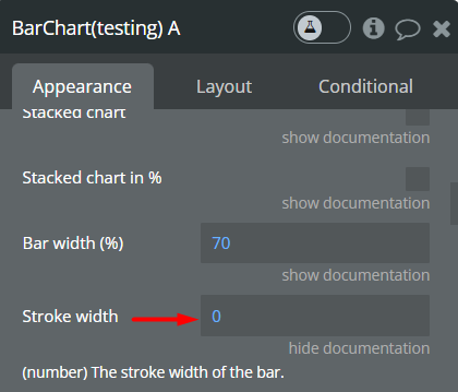
I’m glad to inform you that the plugin has been updated to version 2.17.0 - Fixed zero-value optional fields. Please update to the latest version to benefit from this fix.
Additionally, you could set the Stroke width to 0 if you want the negative bar not to be seen at all.
Please let us know if everything works well inside your app.
Thank you for your patience.
Best Regards,
Daniel.
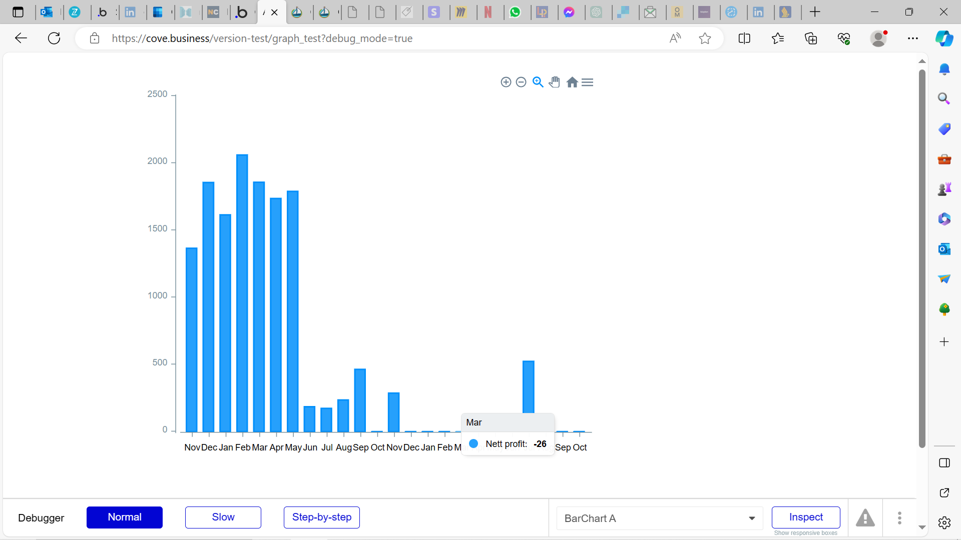
Hello Daniel
This works now, thank you. However, because I need to have two graphs in order to achieve what I need to see, I don’t think I can set the second one so that the y-scale uses the same numbers as the first one? See the example below, using my data, which creates the impression that the negative numbers are as big as the positive ones
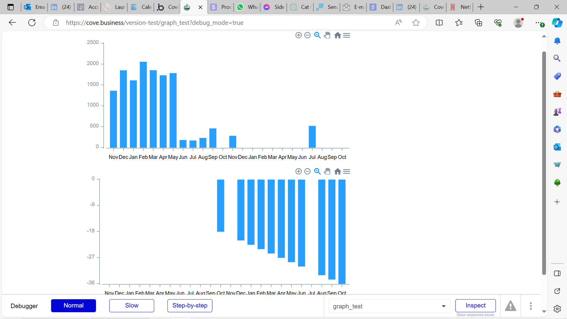
Thank you
Debbie
1 Like
Hello @debbie,
I’m glad that our fix helped you!
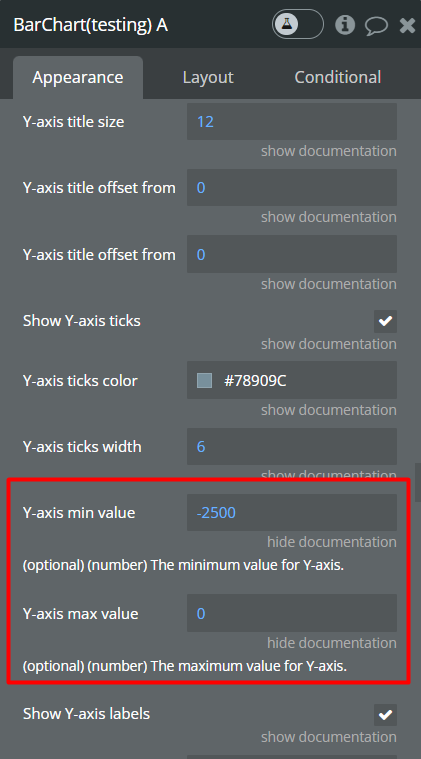
Regarding your last question, please set the Y-axis min value to -2500 and the Y-axis max value to 0, this will make the chart behave as you wish.
Hope this helps!
Best Regards,
Daniel
Hi Daniel
Unfortunately that won’t help, because the maximum value for a given user could be variable… and so setting a fixed value too high could mean the graph would be very small (and conversely setting it too low would mean some information wouldn’t show).
Thank you
Debbie
1 Like
Hello @debbie,
We currently have a reduced staff due to the Christmas holidays, but rest assured, we remain dedicated to helping you.
I’ve come up with an idea that could solve your issue. You could set the current user’s min/max graph height as dynamic values. You could achieve this by creating a column in the database specifically for each user to store their individual min/max values. This way, the graph can adjust according to each user’s data range.
Hope this helps and fits into your workflow!
Happy holidays. 
Best Regards,
Daniel
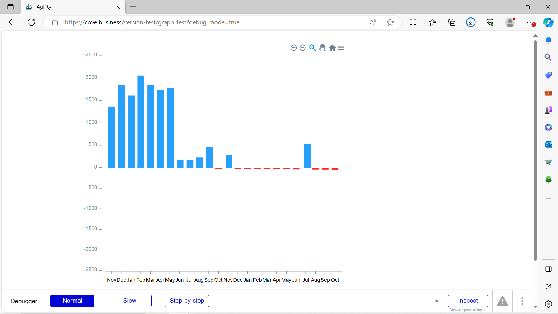
Hi Daniel
Thank you for the suggestion! I have achieved the same Y-axis scale for both charts using dynamic values now (see below), but I can’t see anywhere to change the graph’s HEIGHT using dynamic values? And so in my example, the scale is now the same but I really only want the height of the second chart to be relative to the largest (minus) value.
Thank you!
Debbie
Hi @debbie,
Thank you for your update, and sorry for the delayed reply. Regarding your question about dynamically changing the height of the second chart to be relative to the largest (minus) value, currently, this functionality may not be directly possible within the plugin’s existing features.
However, I will certainly investigate what can be done to meet your requirement. We’re always looking for ways to improve and accommodate user needs, so your feedback is very valuable.
Thank you for your patience and understanding!
Happy holidays.
Best Regards,
Daniel.
Hi @debbie,
I have discussed your use case with the dev team. If you want to dynamically control the height of charts and the chart height to adjust based on the data values, you could try leaving the y-axis minimum and maximum values unset (leave them empty). This will allow the y-axis height to automatically adjust according to the data.
However, if this doesn’t align with your expectations or we’ve misunderstood your goal, I would need more detailed information, particularly about the expected result.
I hope this helps!
Best Regards,
Daniel.
Hi Daniel
Yes, this works. However, as I need to have two separate charts (one for positive and one for negative) and the negative value range probably won’t be the same as the positive value range, I get the issue I shared before.
I think the easiest approach from your side (as and when you could do it), would be either to:
- have the option for a horizontal grid line across the graph at the zero mark
- allow the colour of a bar to be one colour if it’s positive and another if it’s negative
Many thanks
Debbie
1 Like